
Letter B logo design
Bytex
Client request
Letter B logo design for engineering consultancy and design activity for software and electronics in the industrial automation sector. The idea comes from byte + exploration, or rather the idea of accompanying customers in exploring new information technologies to embrace the new paradigms of industry 4.0.
concept
First of all the logo design created merges together the letter “B” (the initial of the Bytex company name) and the letters “e” and “x” (representing the abbreviation of experience), placed at the end of the Bytex name. This symbol recalls various concepts and has different references: symbol of infinity, then the symbol of the hourglass which recalls time and its optimization in the industrial sector, and lastly the workflow and industrial automation represented by the 3D shades of the symbol. In conclusion, the symbol also conveys a reference to the digital world very well thanks to the colors and the type of logo created for the Bytex writing.
Workflow and automation, are the base idea, that is amplified by the use of the logo to support the identity, creating backgrounds and graphics to further strengthen the visual identity of the brand and the related values to be communicated.
The logo appears modern and serious due to its geometry while playing with the shape (which when colored with shades and not a flat color) gives the idea of 3D and a strong reference to technology and the technical world. Colors chosen for this logo design are suitable for the type of business and give a reference to the digital world.

Activity
Logo design with letter B concept for industrial automation business.
Sector
Branding for Industrial and Technology Companies
Locality
Pisa, Italy.
Website
Colour Palette
The colour palette is built on shades of blue and embodies Bytex’s technological spirit and forward-looking approach. At the heart of the visual identity are three-dimensional gradients and digital tones that evoke the concepts of flow, automation and time optimisation. The use of dynamic gradients brings modernity and depth to the brand, echoing the world of advanced industry.
| Logo Design Color CMYK | C100 M95 Y5 K0 | C70 M15 Y0 K0 |

Typography
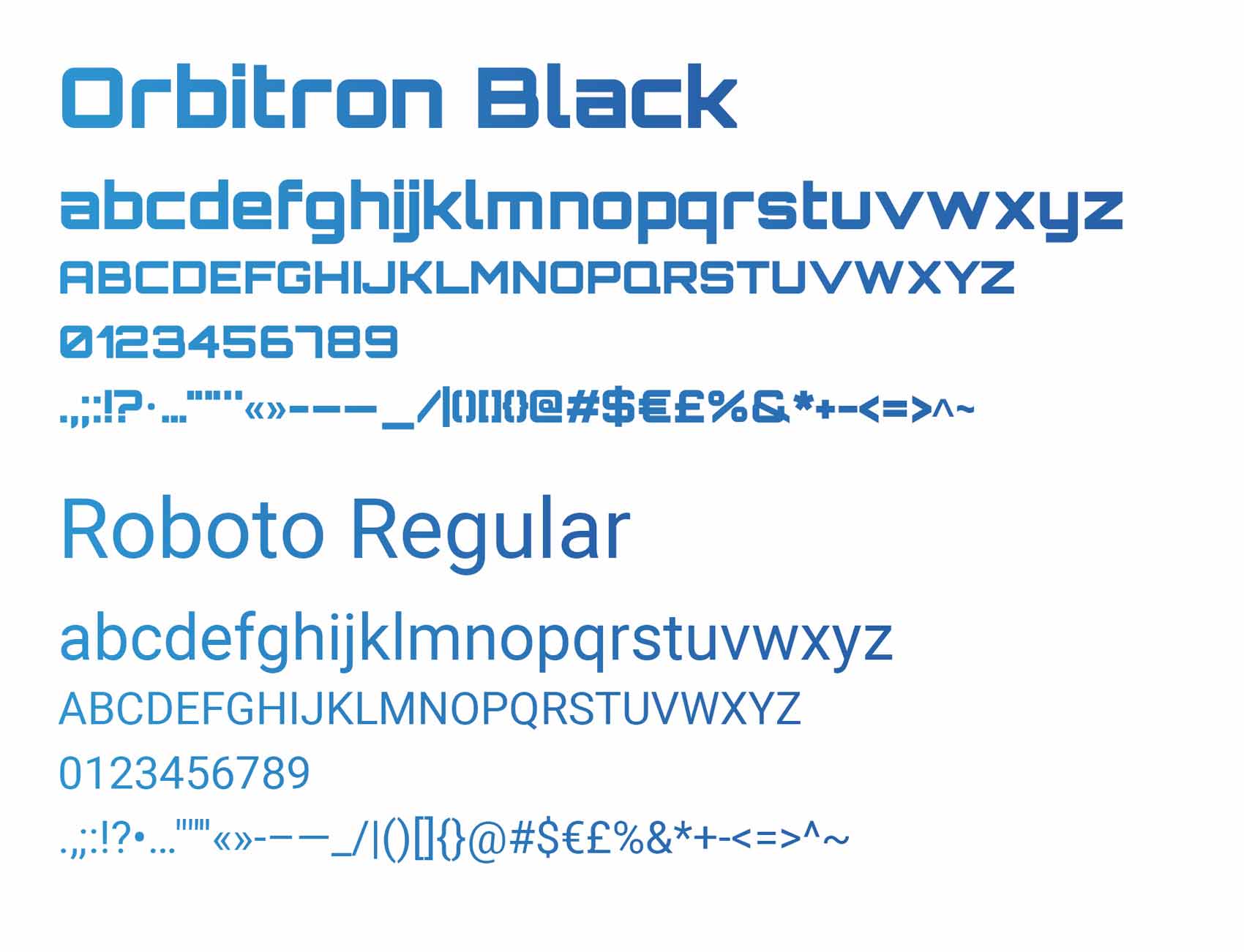
Bytex’s typographic choice reflects a perfect balance between geometric precision and maximum readability. The primary font, Orbitron Black, defines the brand’s core character: a geometric typeface deeply rooted in tech aesthetics, ideal for high-impact headlines and for reinforcing the identity’s modern, technical edge. In contrast and in support, the secondary font Roboto Regular brings linearity and neutrality, with clean development and excellent rendering on both print materials and responsive digital interfaces.
Symbol Construction
The symbol is born from a geometric synthesis that merges the letter “B” of Bytex and the initials “eX” (experience) into a single continuous stroke. Its structure simultaneously recalls two powerful visual archetypes: the infinity symbol, representing digital flow and constant evolution, and the silhouette of an hourglass, a metaphor for time optimisation and efficiency in industrial automation.


Logo application – Social icons
The logo icon can also be used separately to create icons to be used for social networks.

Brand Identity design
The logo is presented on real media, such as business cards and letterhead, with a preview of the responsive coming soon page of the site.


Alternative logo design proposal
Alternative logo variations reference the Fibonacci sequence, the pinwheel and the infinity symbol. The company name is also presented in different styles and fonts.


