Logo design Basel
Visual identity system for a painting company
The brief
A newly founded painting company in Basel, in northern Switzerland, asked me to develop from scratch not just a logo, but a complete brand identity paired with the design of the company website. The goal was to create a coherent visual system able to represent the business across every key touchpoint with customers. The brief called for a classic style with retro influences, warm colours, and an abstract symbol able to convey creativity, colour harmony and attention to detail — qualities central to a business that works daily with colour, surfaces and interior decoration.
This project grew into a full identity system, including logo, colour palette, typography, corporate design, jobsite materials, business cards, letterhead, decorative applications and a gift card. In a second phase, the brand identity was extended into digital through the design of the company website, creating consistent communication between physical materials and the online presence.
The Brand Identity concept
At the heart of the identity is an abstract symbol that conveys professionalism, creativity and attention to detail — the same values the company brings to its daily work. The mark references brushstrokes, interior decoration, and the ability to compose custom patterns. I worked with a gradient that adds depth to the symbol and creates a subtle three-dimensional feel, while the circular shape suggests a complete, continuous view of the work.
Seen from different angles, the symbol’s structure can also evoke continuity and infinity, creating a visual element open to more than one reading. The goal wasn’t to design a standalone logo, but to create a distinctive element able to become the starting point for the company’s entire visual system.

Scope of work
Complete brand identity and website for a painting company in Basel, including logo design, visual identity, colour palette, typographic system, jobsite materials, business cards, letterhead, decorative applications and digital presence.
INDUSTRY
Branding for Freelancer and Self-employed professionals
Location
Brand identity created in Basel, Baselland, Switzerland, developed for a local business in the Basel and northern Switzerland area.
Website Design
Colour palette
The colour palette was designed as an integral part of the brand identity, not simply as a set of colours applied to the logo. I chose warm, deep tones able to work together and create a distinctive visual presence. The combination of colours allows the system to adapt across physical materials, digital applications and different surfaces.
The palette also makes the identity instantly recognisable and gives the visual system greater flexibility in application: from the main symbol to printed materials, all the way to the website and digital communication.
| Logo Design Color CMYK | C82 M29 Y29 K9 | C0 M76 Y85 K42 | C10 M62 Y100 K1 | C58 M54 Y54 K8 |


Typography
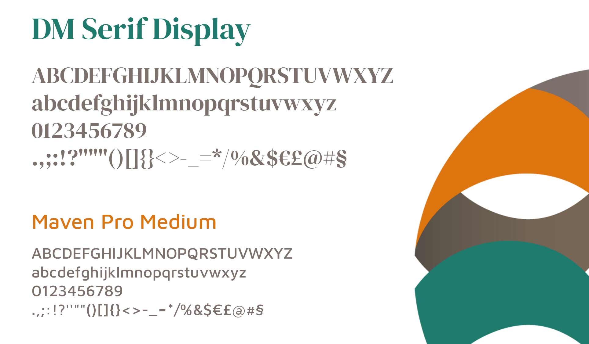
Typography was also designed as an integral part of the brand identity. For the logo I chose DM Serif Display, an elegant, distinctive serif typeface able to dialogue with the shape of the symbol and give the brand a refined, professional personality. Its forms help build a recognisable identity while balancing classic character with a contemporary edge.
For the tagline I used Maven Pro Medium, a cleaner, more contemporary sans serif that creates a balanced contrast with the serif logo typeface. This pairing clearly distinguishes the brand name from the descriptive message, creating a legible, coherent visual hierarchy. The combination of DM Serif Display and Maven Pro Medium helps define the character of the entire visual identity and can be applied consistently across the brand’s materials, from print communication to the website.
Extending the brand: decorative pattern
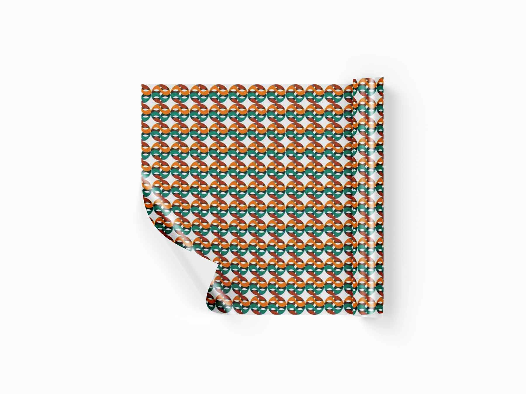
A solid identity doesn’t stop at the logo. The symbol was designed to also work independently, becoming the basis for a decorative pattern used for backgrounds, surfaces, graphic applications and even wallpaper. This lets the brand keep a recognisable presence even when the main logo isn’t directly in use, turning a single graphic element into an active part of the entire visual system.
brand identity design Malerarbeiten in Basel Baselland surface wallpaper design

Extending the brand: social icons
The same symbol can be used as a social media icon or as an identifying element in smaller formats. Its structure was designed to stay recognisable even at small sizes, letting the brand use the same visual language across different digital contexts.

Brand identity design
Business card and letterhead carry the same visual identity into the company’s physical materials. Every element was designed to stay consistent with the logo, colours and typography, showing how a complete brand identity can become a recognisable system even through the everyday details of business communication.


Gift card as a brand extension
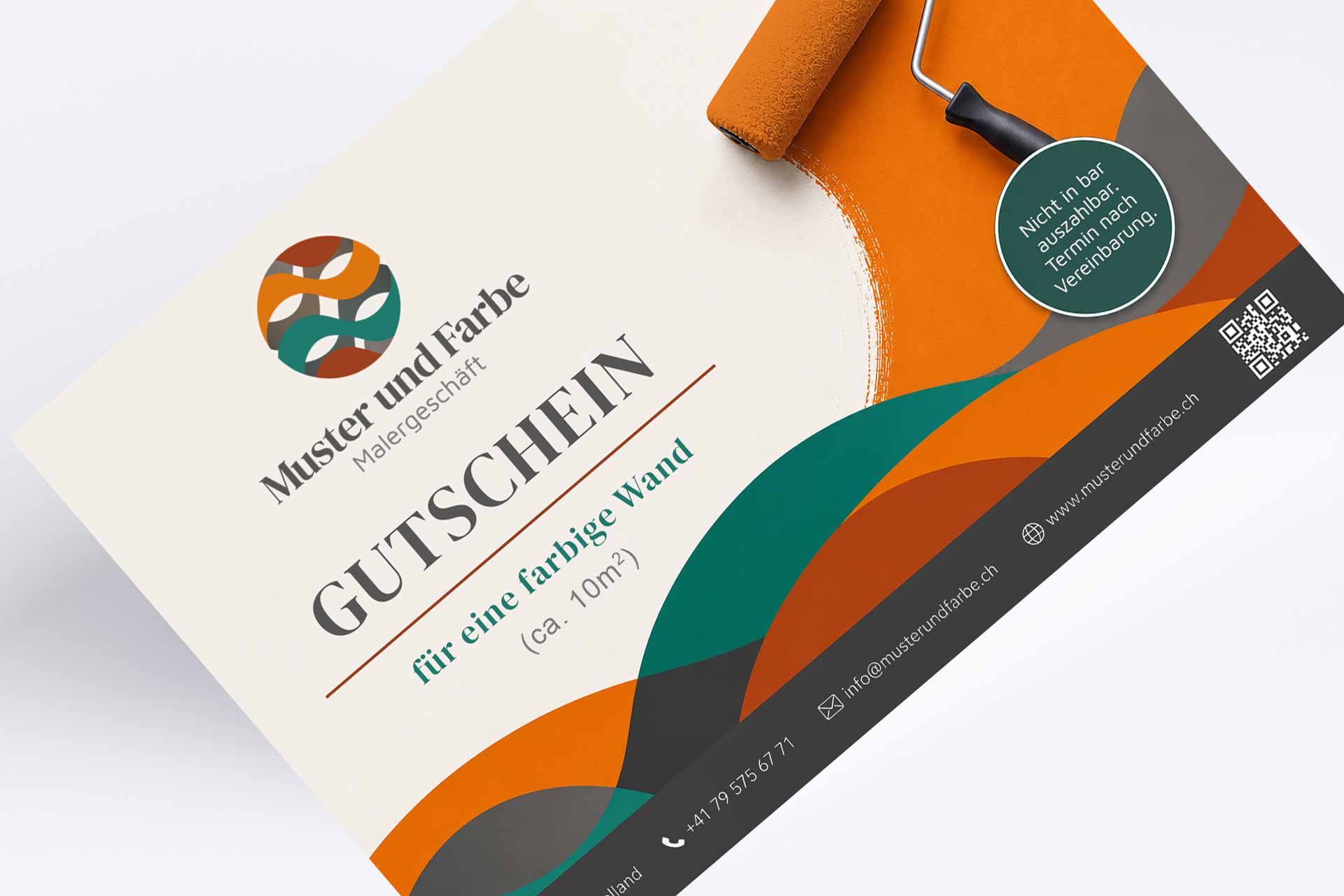
The gift card was also developed as part of the visual identity system, keeping the same colour palette, symbol and typographic language as the rest of the brand.
The brand in digital: website
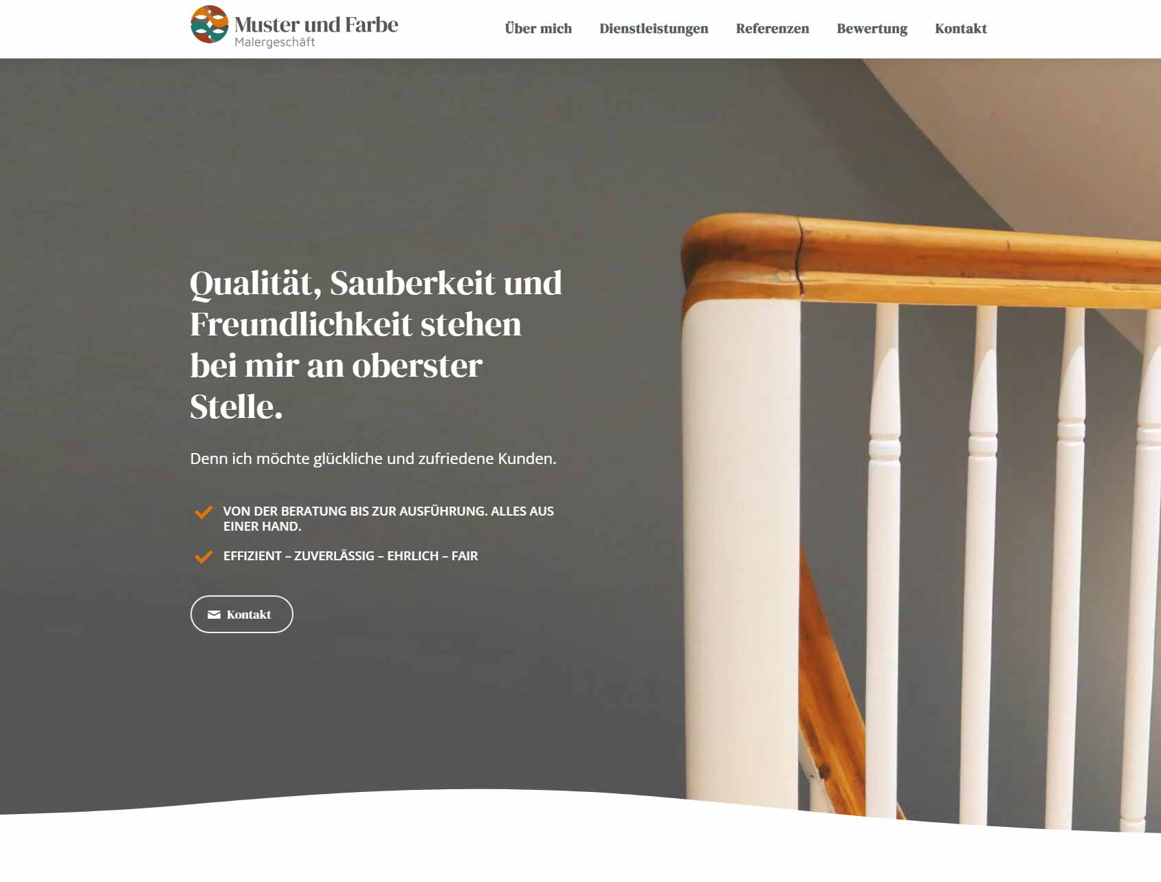
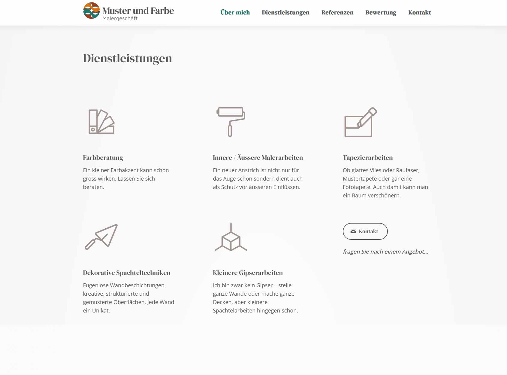
After developing the brand identity, the project extended into the company’s digital presence through the design of the company website. This step mattered particularly because it carried the same visual language built for the brand online. Logo, colour palette, typography and graphic elements were integrated into the site to create a consistent experience between physical and digital communication.
In this project, brand identity and website weren’t developed as two separate elements, but as parts of the same communication system. The identity defines the brand’s visual language, and the website extends it into digital, letting the company present itself consistently to its customers across every channel.
A second direction explored
I give the client a comparison between different visual approaches, I also developed a second brand identity direction. The alternative proposal used a symbol inspired by the golden ratio, with a language more focused on precision, proportion and a building’s interior spaces. The typographic choice also followed a different direction to create a distinct visual personality.
Exploring more than one direction is part of my design process: an effective brand identity comes from analysis and comparison between solutions, before defining the final visual system.