Brand Identity Between Italy and China

Baci d’Italia

The Project

Initial Request

A project dedicated to Italian wine, olive oil, food, art and travel culture, developed for the Chinese market. The initial request was to create the logo design and brand identity, followed by the development of additional materials for events and tastings, packaging, catalogues, communication tools and a website developed in English and Chinese.

An international project in which the design needed to connect Italy’s cultural heritage with a Chinese audience interested in wine, art, design, history, gastronomy and travel in Italy. Baci d’Italia was created from the meeting between Italian culture and the Chinese market, with the aim of creating an experience that went beyond the simple import of Italian products.

A Brand Designed for the Chinese Market

Baci d’Italia is a project based in Shenzhen, China, born from the founders’ passion for Italian culture and developed around a selection of wines, olive oil and Italian products, together with experiences related to art, history, design and travel.

The concept goes beyond the sale of products. Through tastings, events, conferences, art lectures and personalised travel experiences, Baci d’Italia transforms wine, gastronomy and culture into opportunities to discover Italian places, people and traditions.

The brief therefore required an identity capable of communicating Italian heritage, culture, passion, elegance and authenticity, while maintaining a sensitivity appropriate for the Chinese market.

An Identity Designed to Be Used

This project did not stop with the logo design.

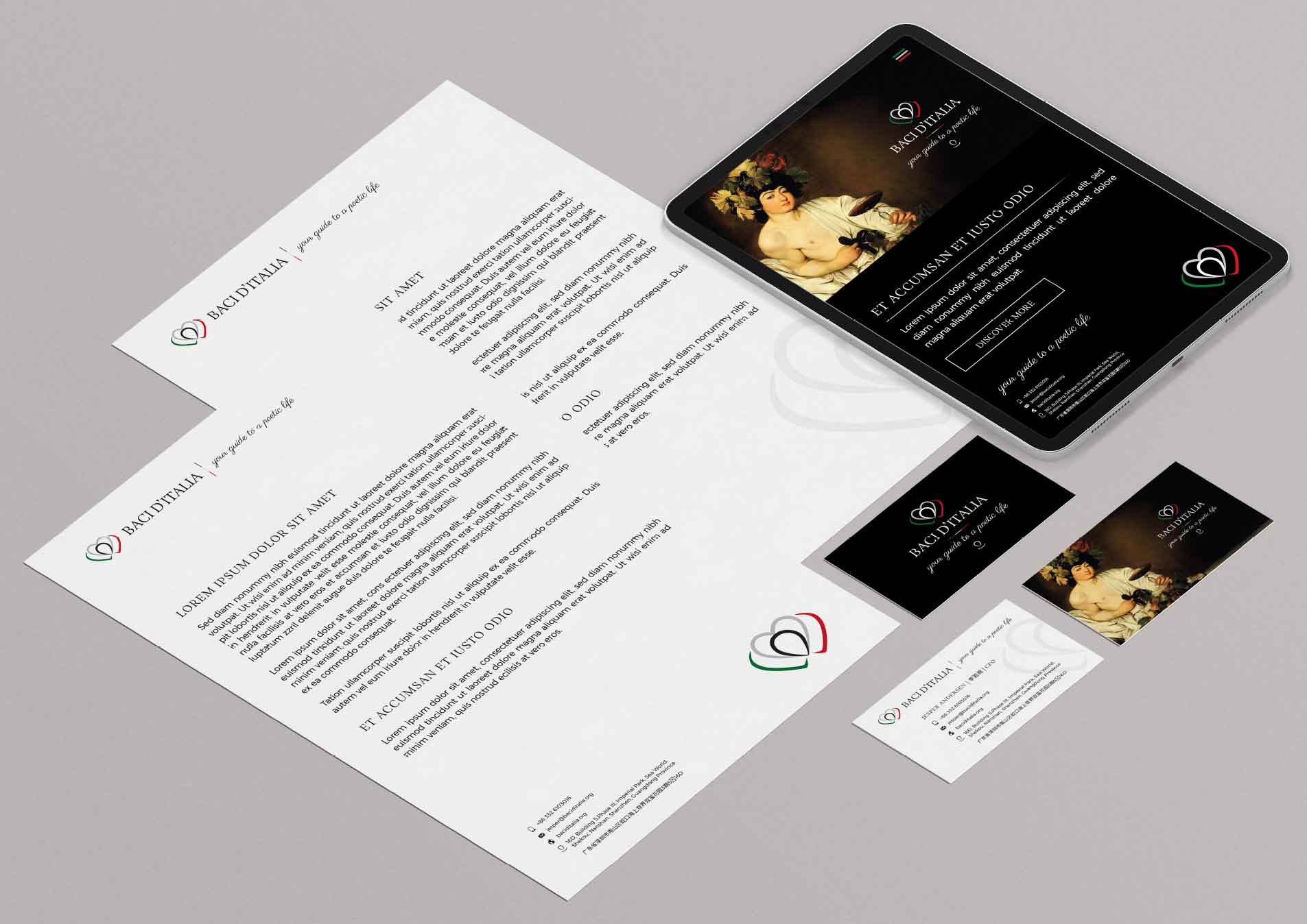
A solid brand identity was developed as a visual system applicable across different communication tools, maintaining recognition and consistency between digital and print applications.

The coordinated materials included:

  • digital letterheads, business cards, event materials, flyers and digital communication
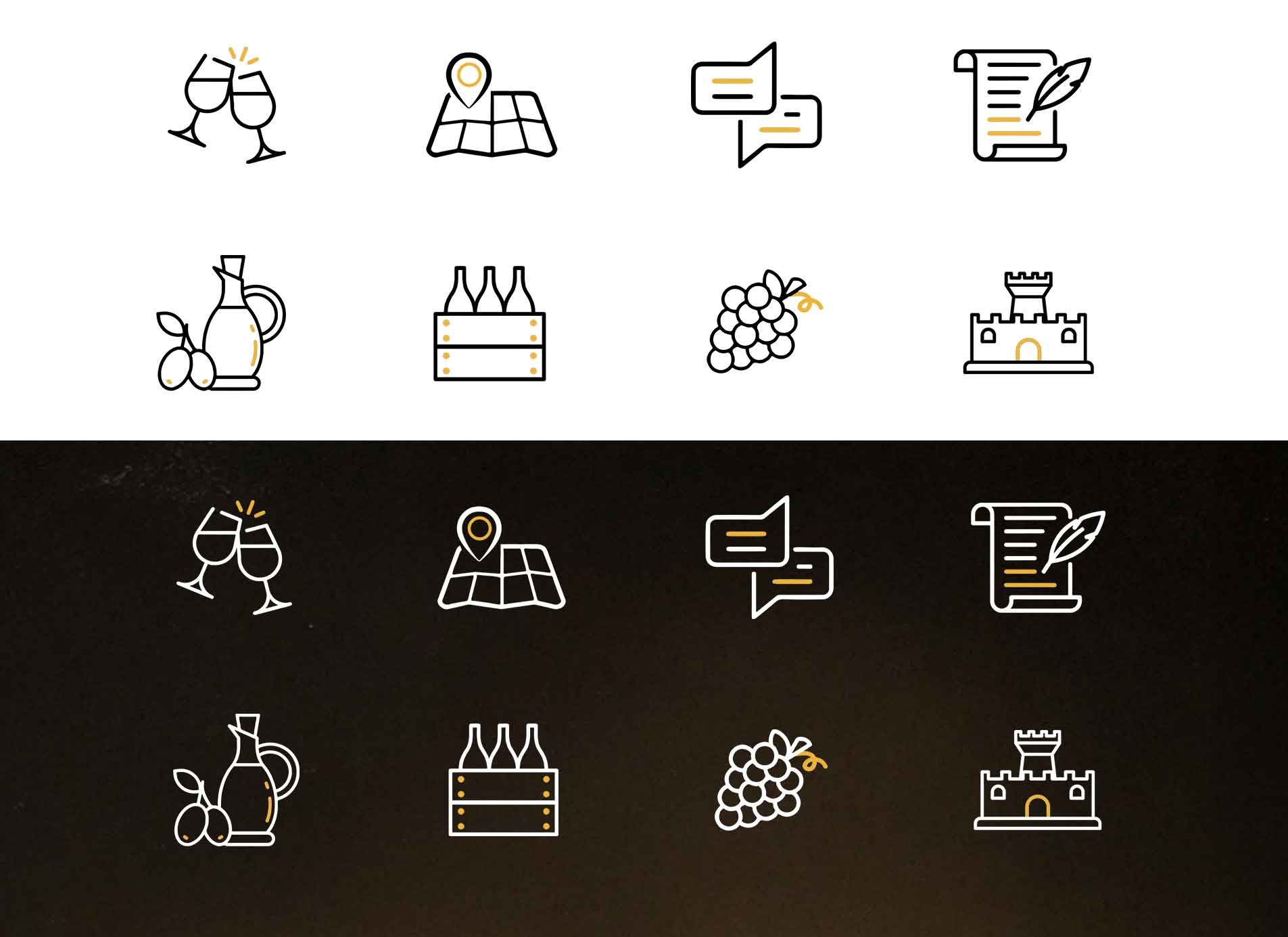
  • graphic elements for social media, materials for tastings and presentations, and a custom icon set created to present the different services and products
  • packaging and gift boxes, printed product catalogues and a bespoke multilingual WordPress website

The result is an identity designed to support the brand across very different contexts, from physical products to digital communication.

Logo Baci d’Italia per il settore del vino e dei prodotti italiani

Project Scope and Objectives

The project included the definition of the brand’s visual identity, logo and graphic system design, materials for events and tastings, packaging, catalogues, communication tools and a website developed in English and Chinese.

INDUSTRY

Branding for the Food & Wine Industry

Geographic Area

Shenzhen, China
Website Design

baci-ditalia.it

Colours and Typography

A Visual Identity Inspired by Italy

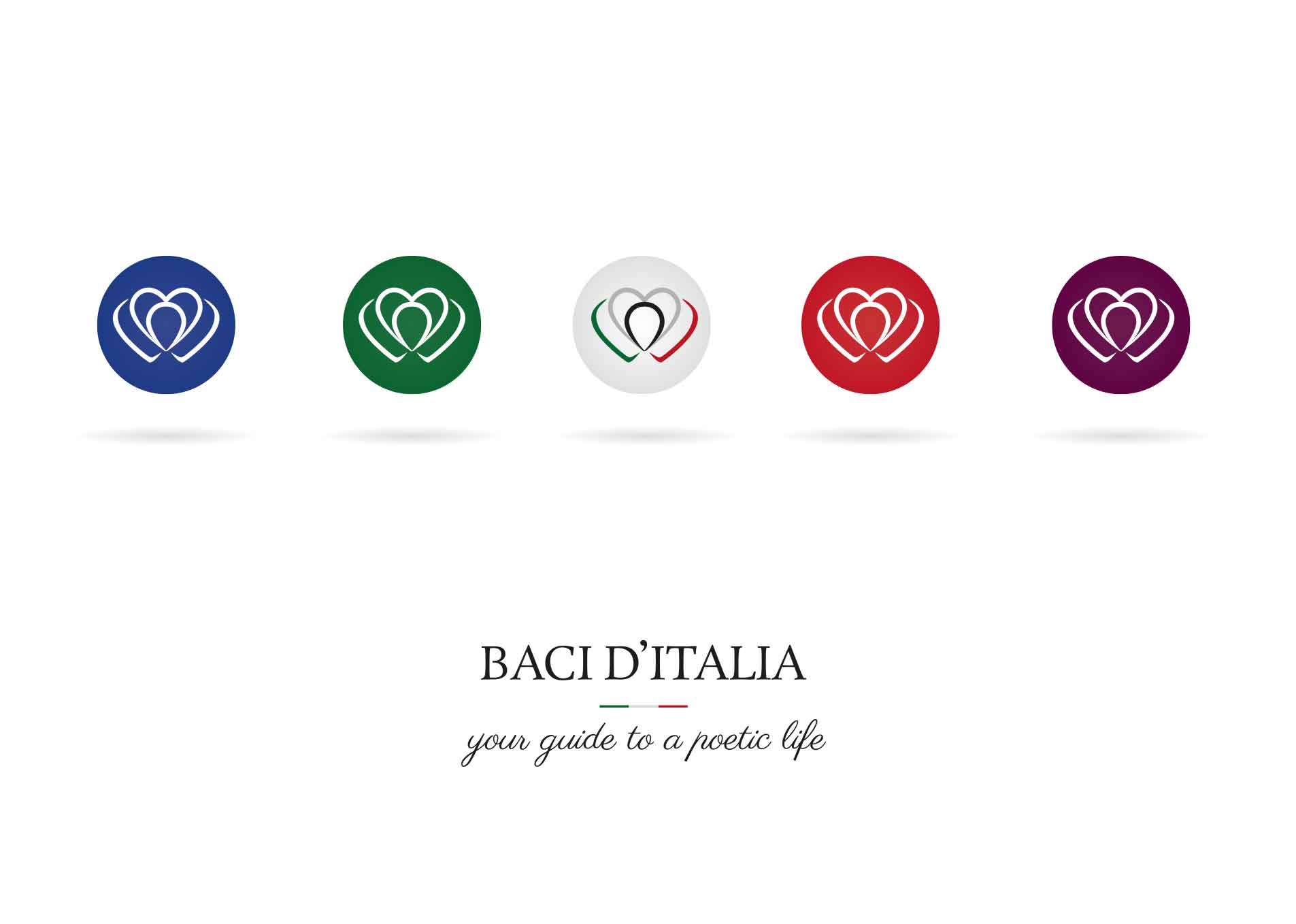
The colour palette was developed to reflect the Italian character of the project and allow the brand to adapt to different types of content and applications.

Green, red and grey provide a clear reference that reinforces the connection with Italian identity, while shades of purple and burgundy more directly evoke the world of wine. Additional colours can be used depending on the product, location or experience being presented.

Typography contributes to the elegant and poetic character of the identity, with Rosavivo as the primary typeface and Parisienne as the secondary typeface. The tagline “Your way to a poetic life” further reinforces the brand’s positioning and experiential approach.

Logo Design
colors Pantone C
P 144-15 C P 179-6 C P 53-8 C P 85-16 C
Baci ditalia wine logo design
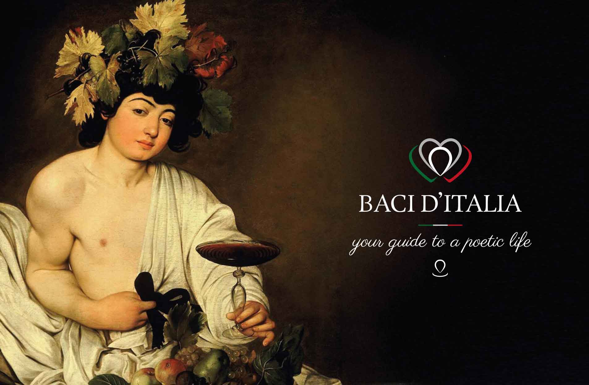
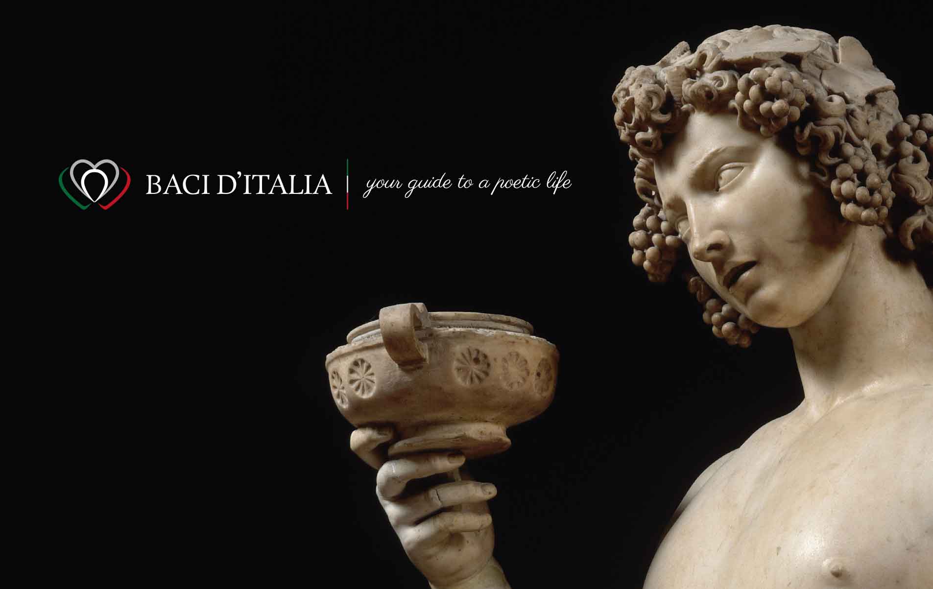
Baci ditalia logo design wine bacco caravaggio

Brand Strategy & Identity

Three Elements, One Italian Experience

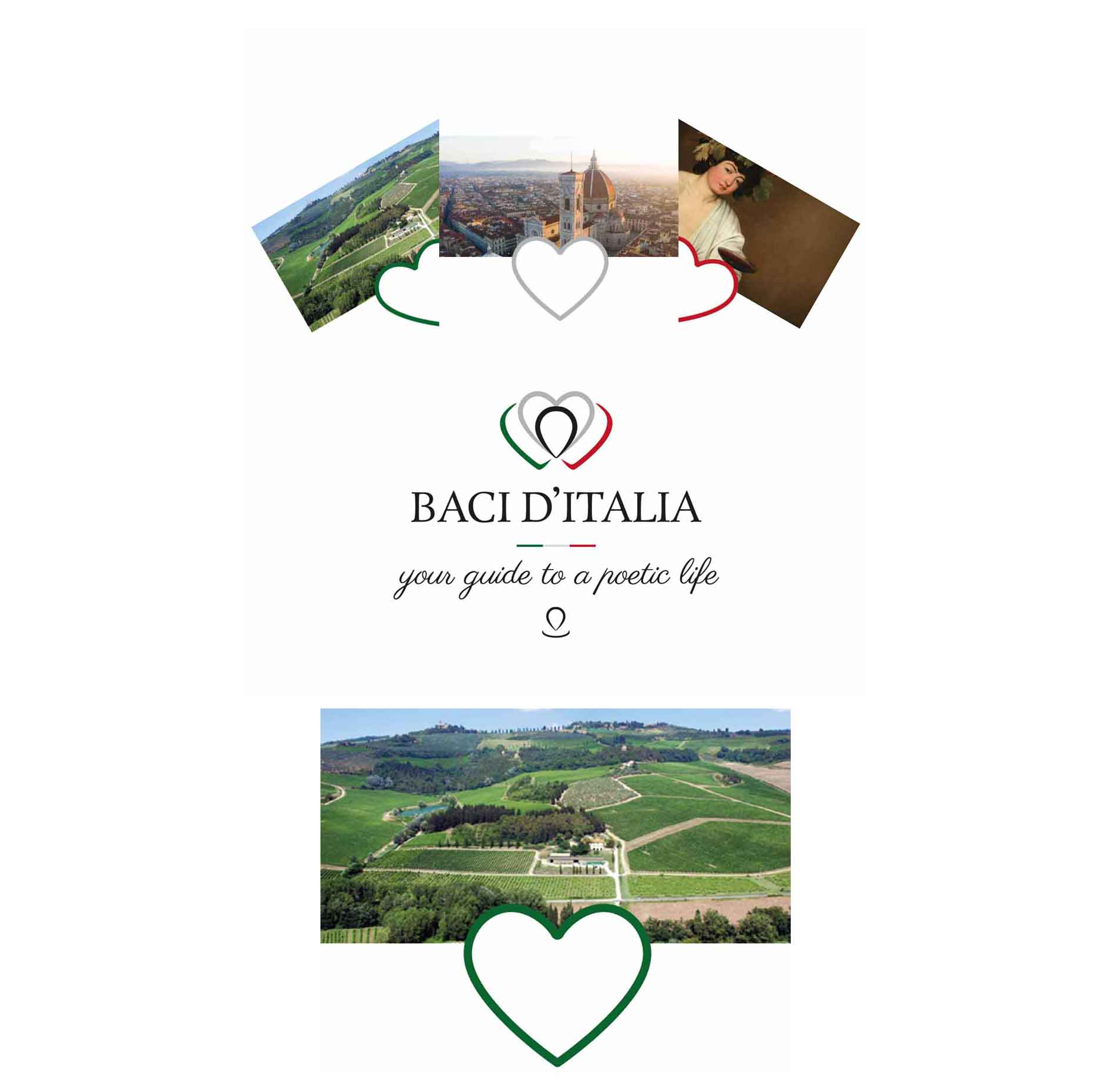
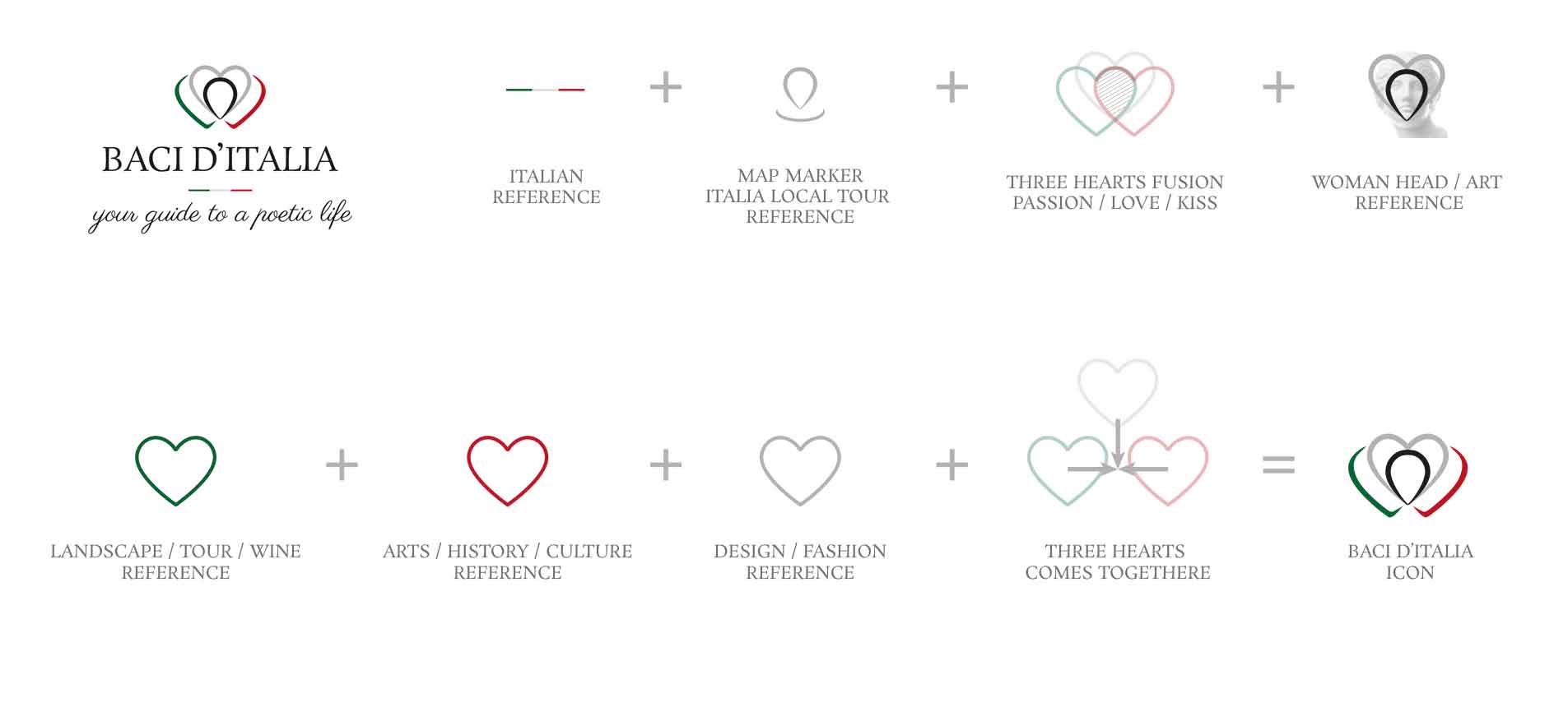
One of the central concepts behind the project is the idea of three elements meeting and merging together. In the identity design, this concept was translated into three hearts, each associated with a different dimension of the Baci d’Italia experience:

  • Land — landscapes, territories, wine and olive oil
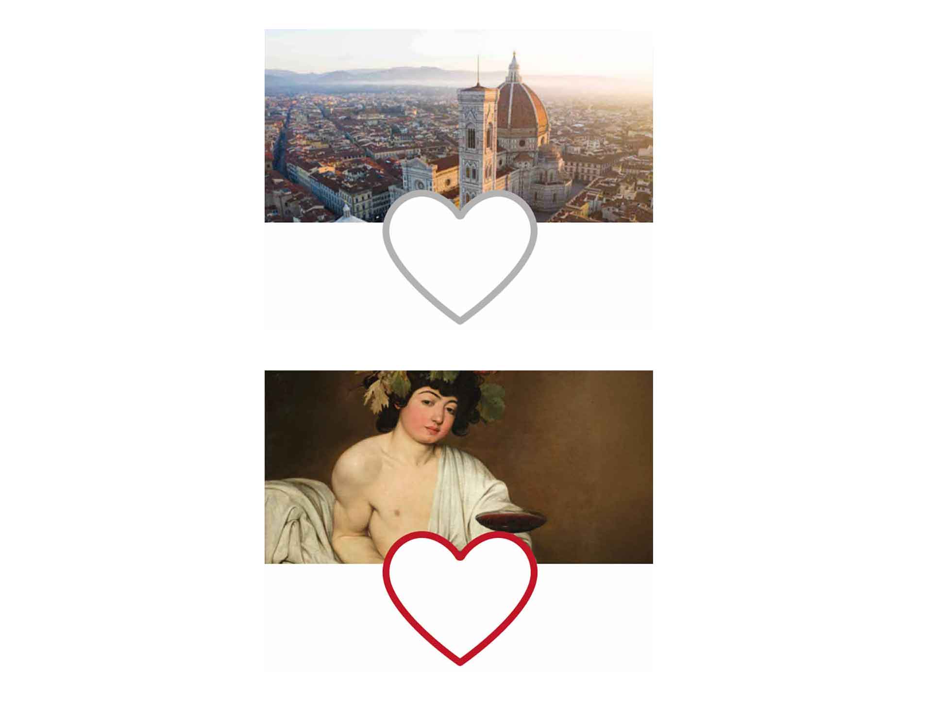
  • Art — history, culture and Italian heritage
  • Adventure — travel, discovery and experiences

Their fusion creates the brand symbol and simultaneously represents passion, love and a kiss.

The result is a visual system in which the elements are not simply placed next to one another but complement each other to represent a broader vision of the Italian lifestyle.

Baci ditalia wine brand application
Baci ditalia wine brand application florence landscape bacco wine caravaggio

The Logo

A Symbol Built Around the Concept of Fusion

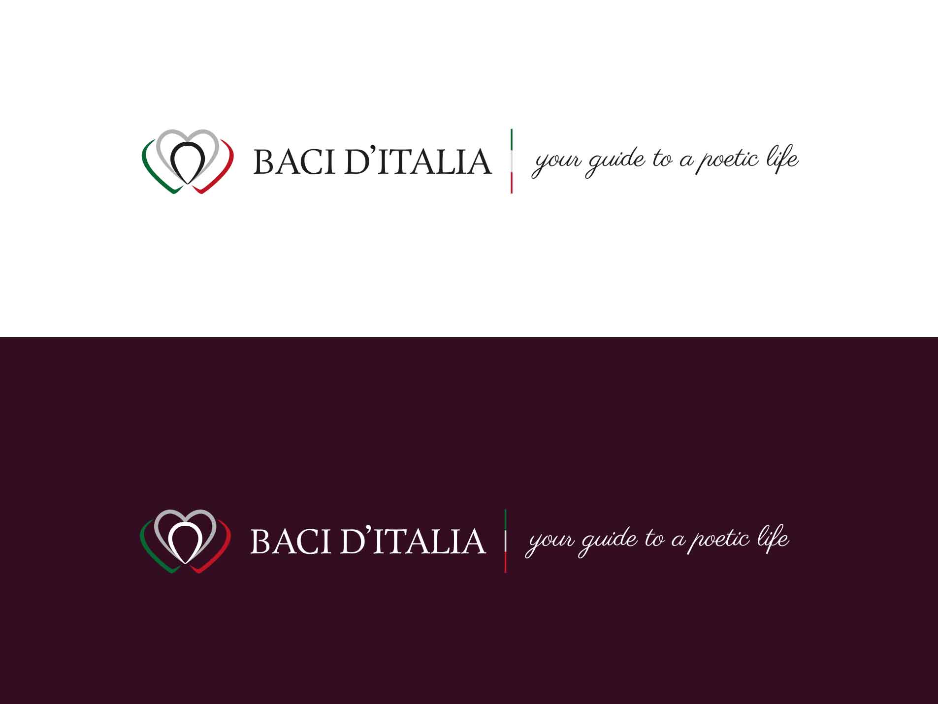
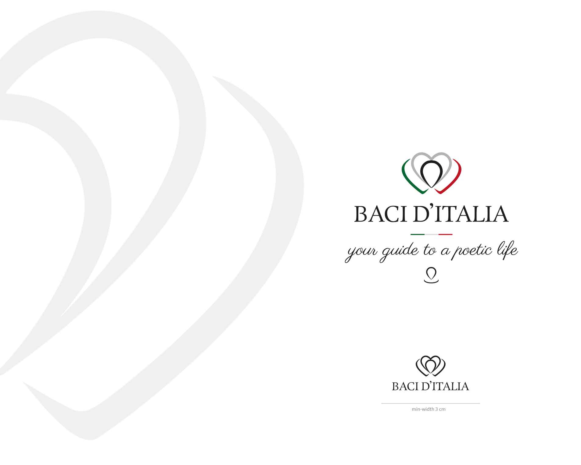
First of all, the Baci d’Italia logo combines three heart-shaped forms that intertwine to create a single graphic element. The symbol simultaneously evokes the concept of a kiss, the union of different experiences within the Food & Wine world, and the connection with specific places in Italy.

The composition can also be interpreted as a map marker, referencing the discovery of selected territories and destinations through itineraries connected to wine, olive oil, art, culture and local traditions.

This symbol also has a more organic and feminine character, with references to floral forms and the figure of a woman, creating a connection with the worlds of art, culture and wine.

Baci ditalia wine logo design concept description wine passion love kiss
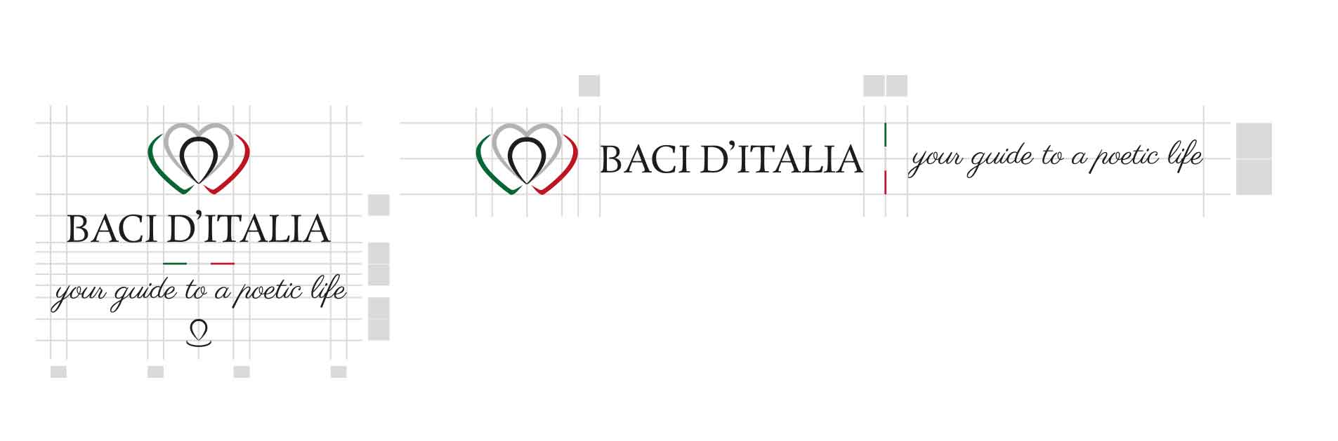
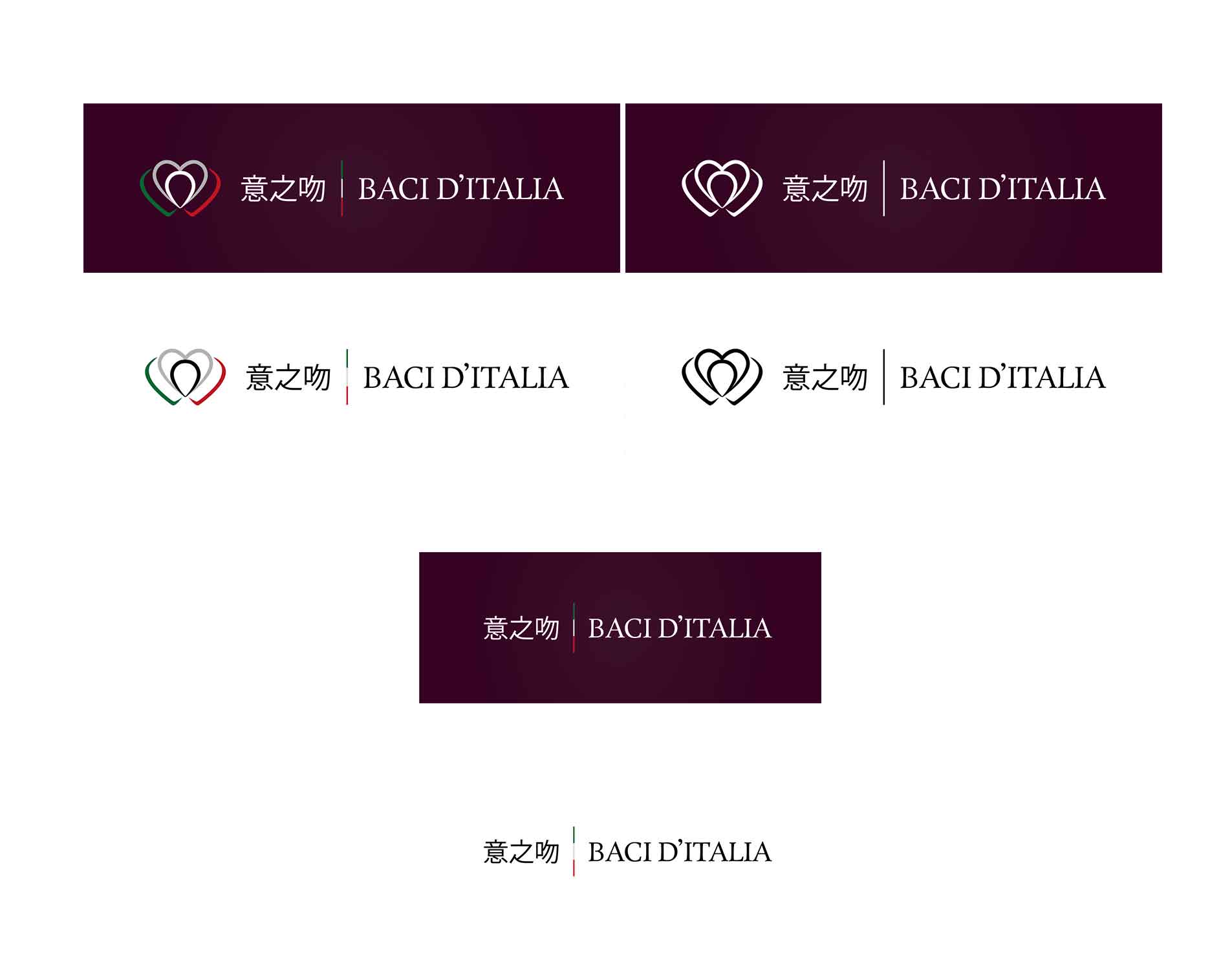
Baci ditalia inline versions logo design
Baci ditalia wine logo design grid and balanced spaces
Baci ditalia wine brand application photo image example

An International Project

Wine Branding and Visual Identity

Baci d’Italia is one of my international projects, developed for a company based in Shenzhen, China, and built around the promotion of Italian products and culture.

As the project operates within the Wine & Food sector, the visual identity is reinforced by references to Bacchus and artistic imagery associated with wine, including works inspired by Italian art and culture. The project required a particularly careful approach to the relationship between two different markets and cultural contexts. The brand identity was therefore developed to maintain recognisable references to Italian territories, art, wine, gastronomy and lifestyle while adapting to communication primarily intended for the Chinese audience.

I also created logo variations featuring the brand name in Chinese.

This international approach involved not only the logo but the entire communication ecosystem: brand identity, printed materials, packaging, catalogues, events and digital platforms.

The project was developed through remote collaboration between Italy and China, with materials created for multilingual communication.

Baci d’Italia is therefore part of my selection of international Brand Identity projects.

Baci ditalia logo design wine colors social icons
Baci ditalia logo design wine bacco michelangelo
Chinese name logo version logo and name design wine color

Communication Design

Bringing the Identity into Communication

The Baci d’Italia identity was also applied to the design of numerous communication tools intended to present products and promote events.

These included digital flyers, tasting materials, invitations, communication for art lectures and editorial materials.

The communication needed to maintain the elegant and cultural character of the brand while also being sufficiently flexible to support different products, events and collaborations.

Baci ditalia wine branding materials

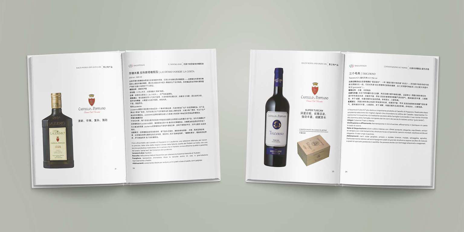
Wine Catalogue / Brochure Design

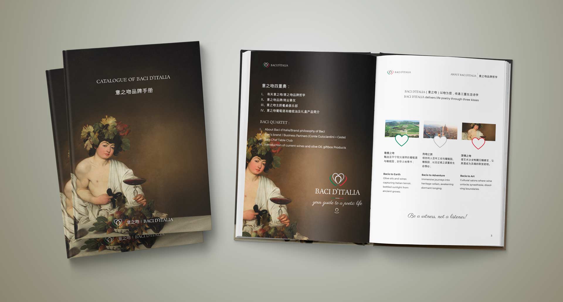
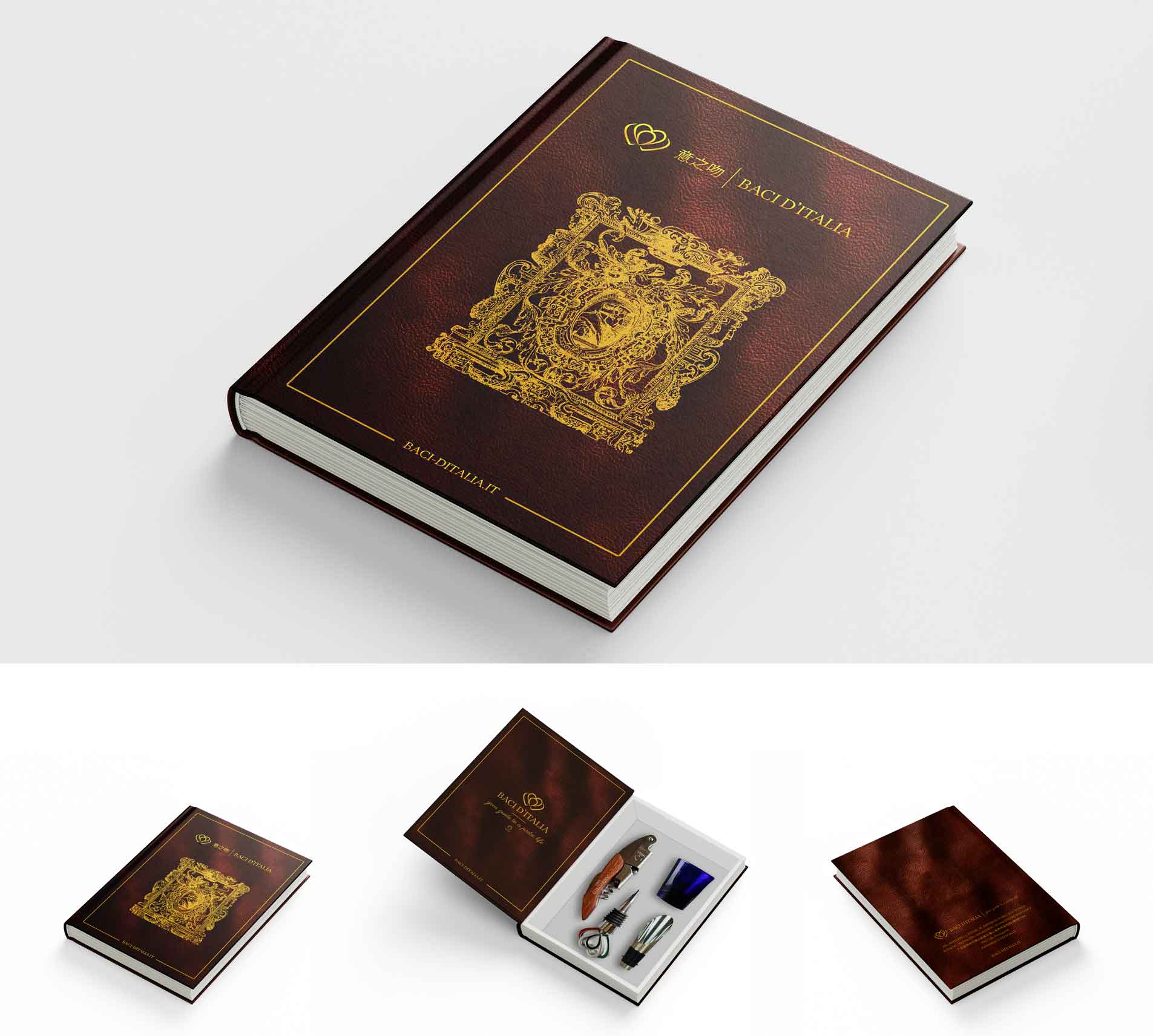
Wine Catalogue Design for the presentation of Italian wines. One of the main editorial tools developed for the project was the product catalogue, designed to present the selection of wines, olive oil and Italian products intended for the Chinese market.

Discover the catalog design project and other printed materials created.

baci ditalia communication design food wine catalog design print preview

Packaging Design

The Identity Applied to the Product

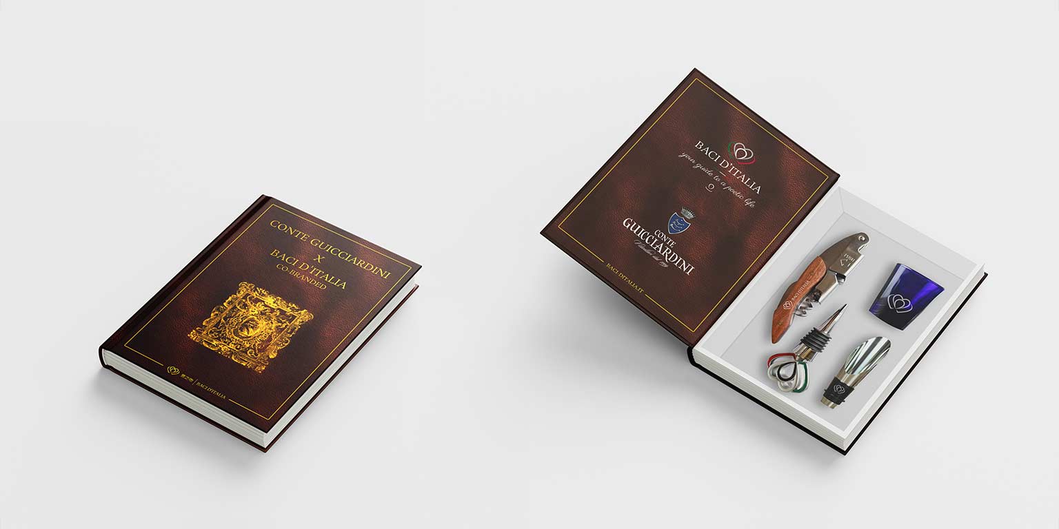
The project brought the Baci d’Italia identity into the world of packaging, with particular attention given to the creation of a gift box designed to present Italian products.

In this case, packaging becomes an integral part of the brand experience: not simply a container, but a tool for communicating Italian culture and enhancing the selection of products.

Discover the Wine Gift Box Packaging Design project.

Wine Packaging Design and Gift Box

The elements developed also included a bottle stopper designed in 3D based on the Baci d’Italia symbol.

This model was developed through the stages of modelling, preparation for prototyping, prototype production and evaluation of the final result. The bottle stopper was designed as a distinctive element of the gift box and as a further three-dimensional application of the brand identity.

Baci ditalia wine gift box packaging design

Digital Design

A Digital Identity in English and Chinese

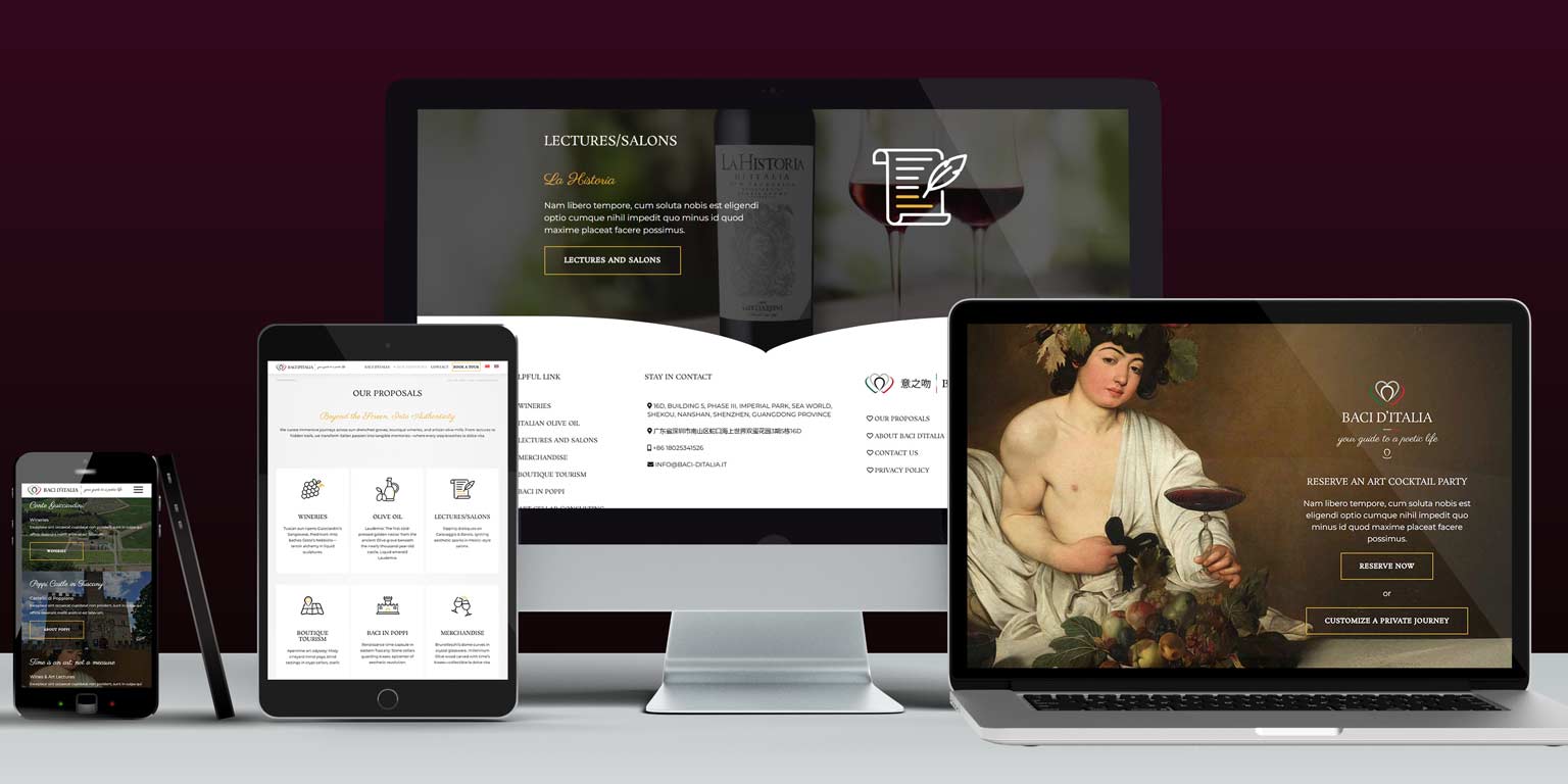
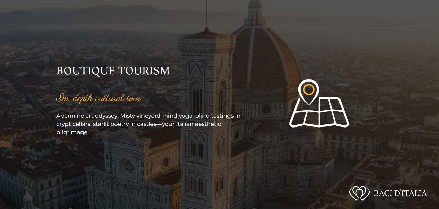
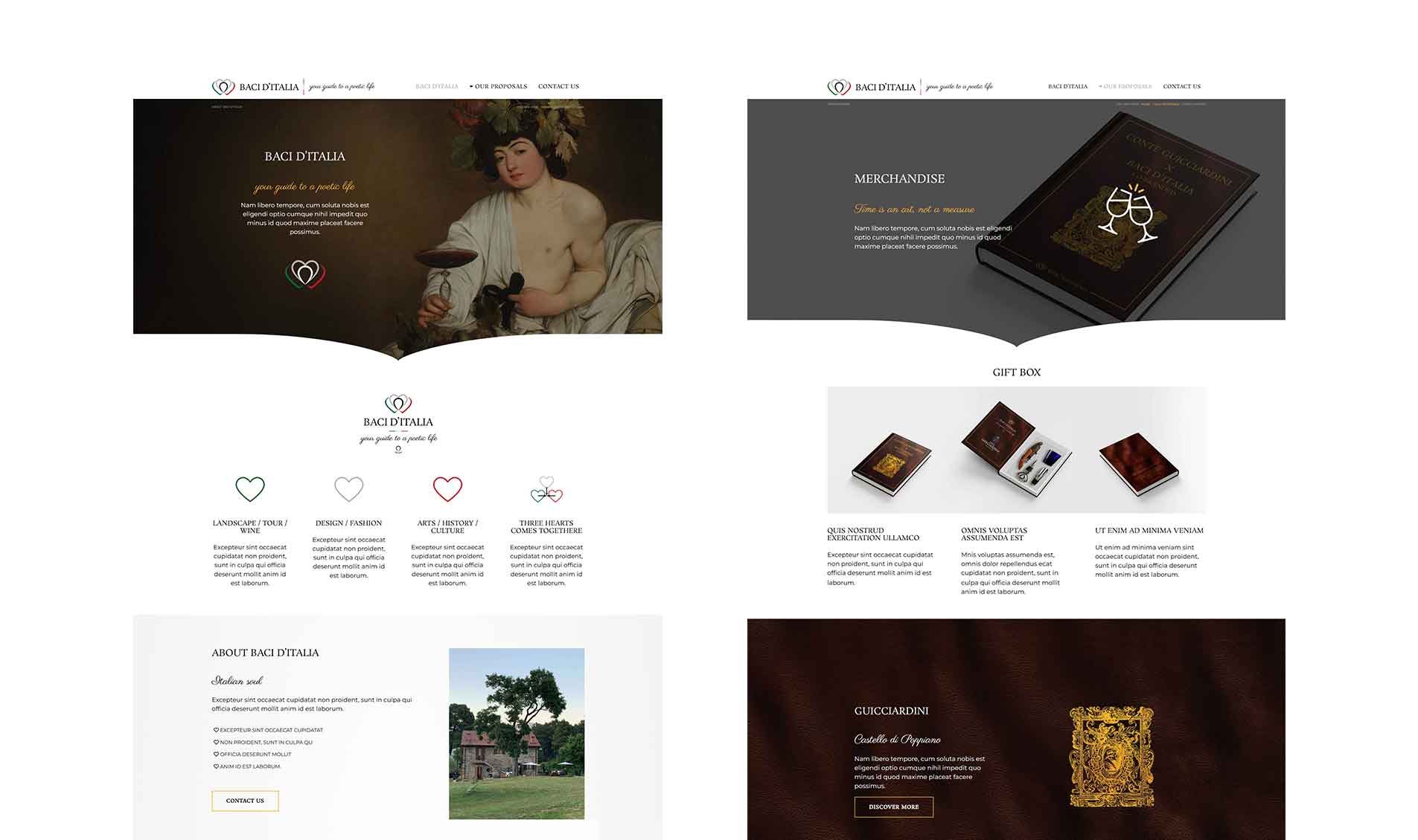
Baci d’Italia identity was subsequently translated into a digital experience through the design and development of the official website. The website was created in English and Chinese, with a structure designed to present the different areas of the business. The multilingual version allows the brand to communicate with an international audience while maintaining a consistent digital presence across both languages.

Discover the Web / Digital Design project.

Baci d'italia digital branding website design preview

A Consistent System Between Physical and Digital

From Brand Identity to Experiences

One of the most interesting aspects of the Baci d’Italia project is the ability to follow the same identity across very different media and touchpoints.

The logo and graphic system were applied to:

Brand Identity → Print → Catalogue → Packaging → Events → Product → Website

This allows the brand to maintain consistent recognition even when the communication context changes. From the packaging of a bottle to the product catalogue and website navigation, every element contributes to building the same visual experience.

To achieve this, it was necessary to create graphic elements capable of being used consistently across different communication tools, particularly across print and digital communication. This included the creation of a bespoke vector icon set for use in printed catalogues, on the website and across social media.

baci ditalia brand identity design
Baci ditalia wine brand application design costum icon set

An Identity Designed to Tell the Story of Italy Beyond Its Borders

Baci d’Italia is a project in which design was responsible for building much more than a visual identity. The system created allows the brand to communicate products, territories, art, culture and travel through a common visual language that can adapt to different communication tools and an international audience. This project demonstrates how a brand identity can become the foundation of an entire communication ecosystem, from the logo to packaging, from editorial communication to digital design.

Baci ditalia wine brand caravaggio web design previews

Do You Need a Complete Visual System for Your Brand?

Baci d’Italia combines branding, communication and digital design within the Food & Wine sector, with particular attention to the promotion of Italian products and their communication to the international market.

Discover other branding projects for Food – Wine & Beverage, or request a personalised quote.

with ❤ from 2012 © Copyright – All the trademarks and logos in this web site are registered by their owners and are subject to copyright. The images and texts of this web site cannot be, totally or partially, reproduced – startup design pro – P.IVA: 03269260125 – Brand Identity Designer & Logo Designer Freelance in Milan (Italy) and Basel (Switzerland) Davide Campagna – Web // Graphic Designer | Privacy policy / Cookie Law