Retail logo design and Visual identity

fireworks store

Customer request

Over the years we have succeeded in making our company known in Sicily and then throughout the national territory and also internationally.
With this new visual identity we want to convey the passion for this activity to the spectators who attend our shows through the search for the perfect synchronization and harmonization between sound, time, rhythm, symmetry of effects and choreography.

The next step involved designing a print-ready flyer to market the brand.

Design idea

The logo and the visual identity strongly recalls the firework and the moment in which it explodes in a night sky. The symbol has been geometrically composed of dots that imitate the effect of firework and the stars on the sky.

In conclusion, circle that contains the graphic symbol and thanks to which it is represented “cut” including the sky at night and also gives the symbol a sort of 3D effect.

The logo design is elegant and transmitting a strong reference to pyro-technic shows. The initial of the name and surname and the “Painters of the sky” payoff fix very well the the sector and will support the communication and the visual identity.

Activities

Retail logo design for Fireworks Store.

SECTOR

Branding for E-commerce, Retail and Physical Stores

Locality

Palermo, Italy.

Color palette

The color chosen refers to an elegant midnight blue and a bright orange that match well with each other and maintain readability on both light and dark backgrounds.

Logo Design Color CMYK C98 M86 Y35 K32 C0 M54 Y88 K0
visual identity fireworks show

Typography & Font Selection

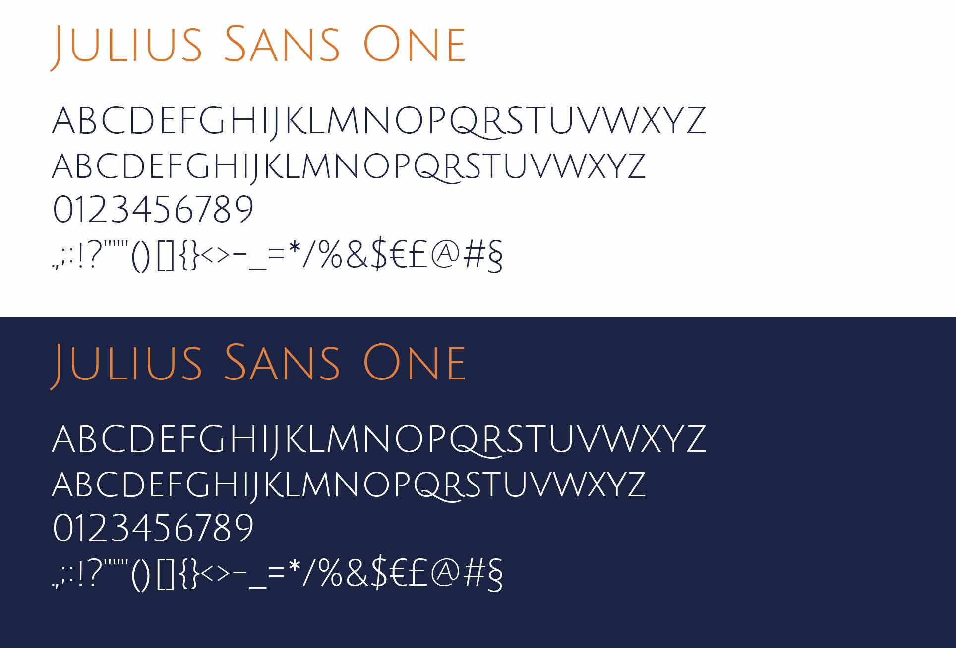
For this project, I chose the Julius Sans One font, a linear and geometric typeface that perfectly reflects the elegance and modernity of pyrotechnic displays. Its clean style evokes the precision of light trails in the night sky and harmonizes seamlessly with the circular structure of the symbol. To ensure the logo remained legible even at small sizes or on complex materials, I redesigned and specifically weighted (bolded) the strokes of the original font.

professional brand identity design typography Julius Sans One font
Visual identity fireworks show

An all-purpose logo

This symbol can be used effectively alone to identify the company or to create graphics to be used for both traditional and digital communication. An alternative circle-shaped version has also been created from use for social networks.

Visual identity fireworks show

Brand Identity Applications

The brand identity design is applied across different real-world touchpoints, including business cards, letterheads, mobile devices, and apparel, demonstrating how the visual system remains consistent and recognisable across different brand applications.

Stationery visual identity fireworks show
T-shirt visual identity

The Logo Applied to the Physical Headquarters

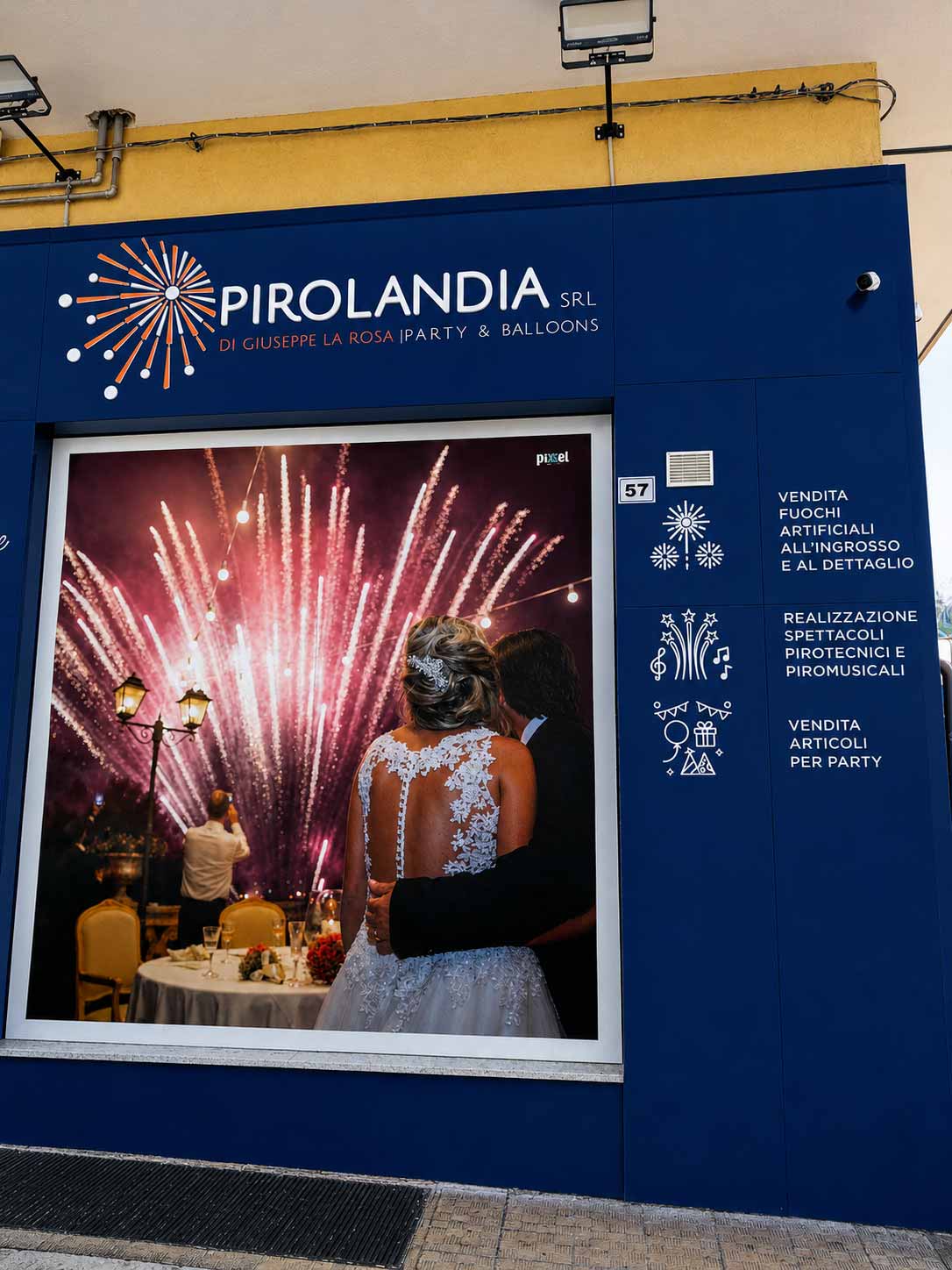
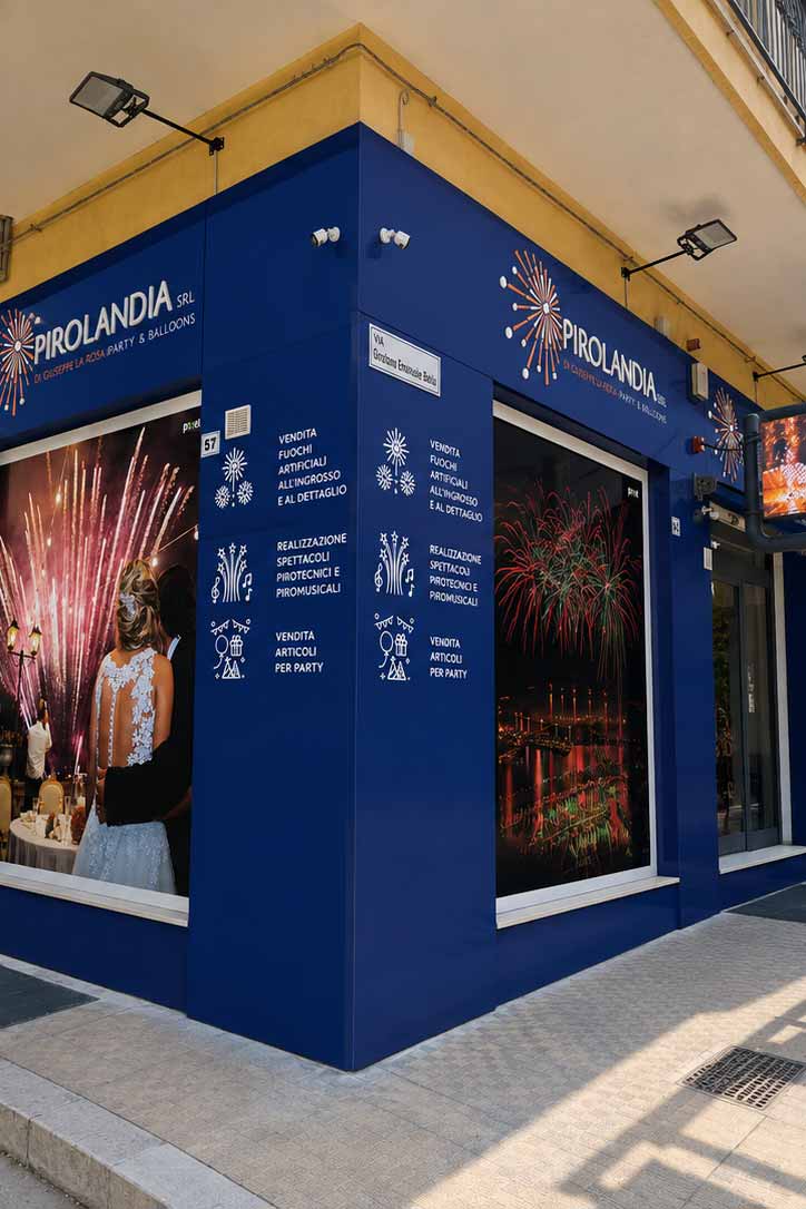
First of all, the visual identity project was developed from the very beginning with its potential physical applications in mind. The correct construction of the logo and the precision of the delivered production-ready files allowed the brand to be reproduced on the company’s actual headquarters, transforming it into a recognizable and highly visible architectural element.

The signs were applied to the exterior corner walls of the building, following its structure and creating a continuous visual presence on both sides of the facility. Furthermore, the logo was crafted in relief, adding greater depth to the signage and making the brand stand out even more against the building’s surface.This is a tangible example of how a professional logo designed with careful attention to proportions, shapes, and legibility can maintain its effectiveness even when transformed from a digital graphic asset into signage, wayfinding, and three-dimensional applications.The photographs of the headquarters showcase the final outcome of the project, demonstrating how the work done on the logo and its technical preparation translated into a precise real-world application.

Logo aziendale applicato sull'insegna esterna della sede
Logo aziendale in rilievo sull'insegna della sede

Alternative logo proposals

During the elaboration of your new identity I will be present you with 2 or more different versions and ideas of the logo, based on what decided in the drafting phase of the brief, and costs chosen. Below are also presented alternative variants with the use of yellow instead of orange and different logo ideas.

Visual identity design fireworks

Logo and visual identity are pillars for any company!

Is your company in a sector where the distinction from the mass is important? Ask now for a quote and making you stand out from the mass!

with ❤ from 2012 © Copyright – All the trademarks and logos in this web site are registered by their owners and are subject to copyright. The images and texts of this web site cannot be, totally or partially, reproduced – startup design pro – P.IVA: 03269260125 – Brand Identity Designer & Logo Designer Freelance in Milan (Italy) and Basel (Switzerland) Davide Campagna – Web // Graphic Designer | Privacy policy / Cookie Law