Packaging logo design

gullo

The Brief

First of all, the client’s request was to design a logo for a gourmet syrup brand, aimed at the beverage industry, the international market, and sales through cafés and bars.

The logo needed to represent a combination of two brand archetypes: 30% The Magician and 70% The Creator. The goal was to build an identity able to communicate creativity, quality, and the ability to turn a simple ingredient into a new flavour experience.

This project was part of a broader engagement on the Gullo brand, which also included developing the Packaging Design system.

Logo Concept

Gullo is a gourmet syrup brand designed to be used in preparing drinks, coffee, milkshakes and other recipes.

Logo concept draws mainly on the archetype of the Creator, with a nod to the Magician archetype through the drop symbol. The goal was to translate these concepts into a simple, recognisable mark that would also work easily across packaging.

The typographic design is built on the geometry of the letters. In particular, the “g” and the “o” use identical circles, creating a precise visual relationship within the logotype. In conclusion, the circular shape also recalls elements linked to the world of beverages, such as a glass or a cup, creating a visual connection with the sector the brand operates in.

logo packaging design

Scope of Work

Logo Design and Brand Identity for a gourmet syrup brand, including the development of the mark and the visual elements for Packaging Design.

Industry

Branding for Food & Beverage, Restaurants and Bars

Locality

Malaysia

Colour Palette

The colours chosen for this packaging logo design are pure black and white, so the logo can take on colour depending on each syrup’s flavour.

Logo Design Color CMYK K100 K0
logo packaging design

Logo Typography

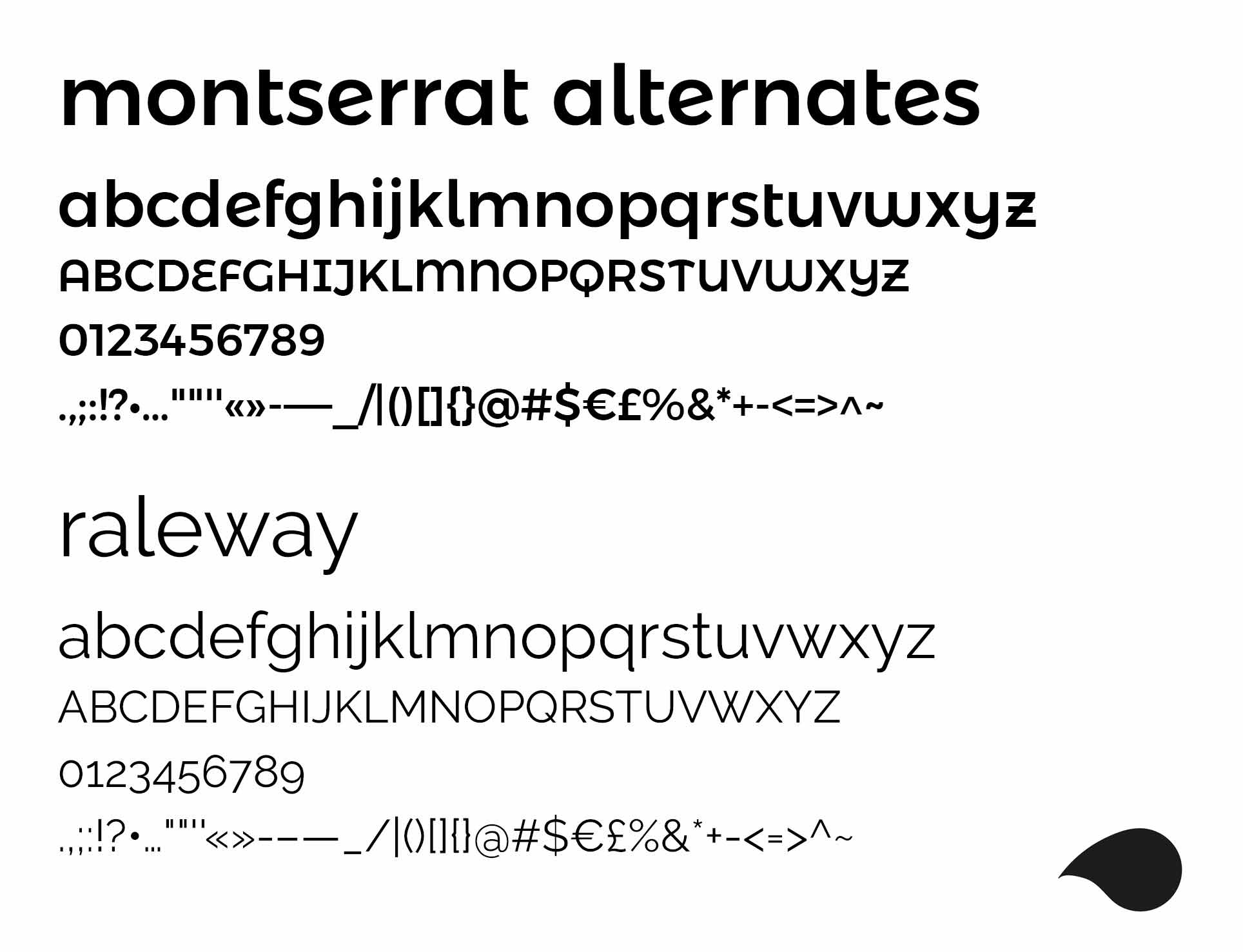
For Gullo’s typographic identity, Montserrat Alternates was chosen as the primary typeface. Its rounded forms integrate naturally with the construction of the logotype and with the circular character of the letters “g” and “o”.

Raleway was used as a secondary font to support the visual identity, chosen for its readability and for creating a balanced contrast. The pairing of the two typefaces keeps consistency and typographic hierarchy across the brand’s different applications, from packaging to digital communication.

logo and brand identity design typography montserrat alternates and Raleway font

The Drop Symbol

First of all, the drop is the brand’s distinctive element and serves several functions within the identity. The most direct reference is naturally to the syrup itself: just a few drops are enough to add flavour and character to a drink. This drop symbol also becomes an integral part of the letter “g”, turning from a simple graphic element into a component of the logo itself.

The same symbol can be used separately from the logotype to create icons, patterns, backgrounds and other graphic elements, helping build a recognisable and flexible visual system.

Logo packaging design
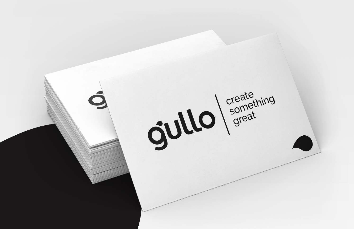
Logo packaging design business card

A Logo Designed for Packaging

For Gullo, the logo wasn’t conceived as a standalone element, but as part of a visual system built primarily for product communication.

Choosing pure black and white lets the mark adapt to the product’s different colour variants. Colour can change according to each syrup’s flavour, while the logo’s structure and the brand’s recognisability stay unchanged. The logo was later applied to Gullo’s Packaging Design system, developing the product variant for the Frappè beverage line.

The graphic system was designed to stay recognisable and consistent even as format, size and label change. Proposals were developed for 250ml and 700ml bottles, with the option to visually differentiate the various flavours.

logo packaging bottle design
Logo packaging design product design

Icon and Identity Applications

The drop becomes a standalone graphic element of the identity and can be used to develop social media icons, decorative elements and coordinated graphics. This flexibility extends the brand’s visual language beyond the logotype, while keeping an immediate connection to the mark.

logo packaging design concept social icons design

Alternative Proposals

A few alternative logo proposals were also developed, exploring different interpretations of the same concept and different typographic solutions for the name Gullo. These proposals made it possible to compare different approaches before defining the visual direction best suited to the brand’s positioning.

logo packaging alternative proposal

A Logo Design, Brand Identity and Packaging Project

The Gullo project shows how a logo can become the starting point for a broader visual system, designed to be applied to the product and to the brand’s various communication tools.

Beyond the brand identity, I also developed the packaging design system for Gullo Frappè, building on a design approach you can see in my Packaging Design portfolio, creating a consistent visual direction across mark, product and labels.

professional drinks packaging design frappe label flavours

Want a logo for your packaging, or a complete redesign?

Do you need a logo for your packaging, or want to redesign it completely? Tell me about your idea: I’ll prepare a tailored quote based on your needs.

with ❤ from 2012 © Copyright – All the trademarks and logos in this web site are registered by their owners and are subject to copyright. The images and texts of this web site cannot be, totally or partially, reproduced – startup design pro – P.IVA: 03269260125 – Brand Identity Designer & Logo Designer Freelance in Milan (Italy) and Basel (Switzerland) Davide Campagna – Web // Graphic Designer | Privacy policy / Cookie Law