
Brand design
Manufacturing corporate Sicimi
CLIENT REQUEST
New brand identity design for a corporate active in the industrial heating systems sector. Creation of a new and modern brand identity restyling, including business card, letterhead and website design. From 40 years S.i.c.i.mi. have been offering solutions for temperature control plant engineering. They requested a logo design pro, including the restyling of the old logo, the old corporate image and website.
LOGO REDESIGN, BEFORE AND AFTER
This corporate redesign explicitly highlights the company’s manufacturing heritage. The original 3D logo has been streamlined into a flat, modern symbol that directly evokes industrial pipes and manufacturing precision. Applied dynamically across stationery and media, the new identity preserves the iconic red color, maintaining strong brand familiarity while professionalizing the overall manufacturing image.

ACTIVITIES
Brand design for a corporate active in the manufacturing heating systems sector. Logo design, responsive website design, brochure and print materials.
SECTOR
Branding for Manufacturing and Technology Companies
LOCALITY
Brand identity created in Carbonate, Como, Italy.
WEBSITE DESIGN

NEGATIVE VERSION
Through the red colours, the logo is capable of very well delivering the shapes and contrasts. A logo design pro offers numerous variations to the client, with and without slogans and on various backgrounds.

BUSINESS CARD DESIGN
To create the logo design pro and the identity design, the brand was coupled with lines and decorations that recall the main logo, to be used in the business card.

LETTERHEAD DESIGN
The brand’s connection to industrial piping is now vastly more prominent, amplified by extending the new visual elements onto stationary like the company letterhead. Across these touchpoints, the logo’s distinctive aesthetic is cleverly repurposed to frame the top and bottom margins of the A4 layout.

BROCHURE DESIGN
Real-file- example of the A4 Brochure cover design.

Completing the Corporate Identity with a Modern Website
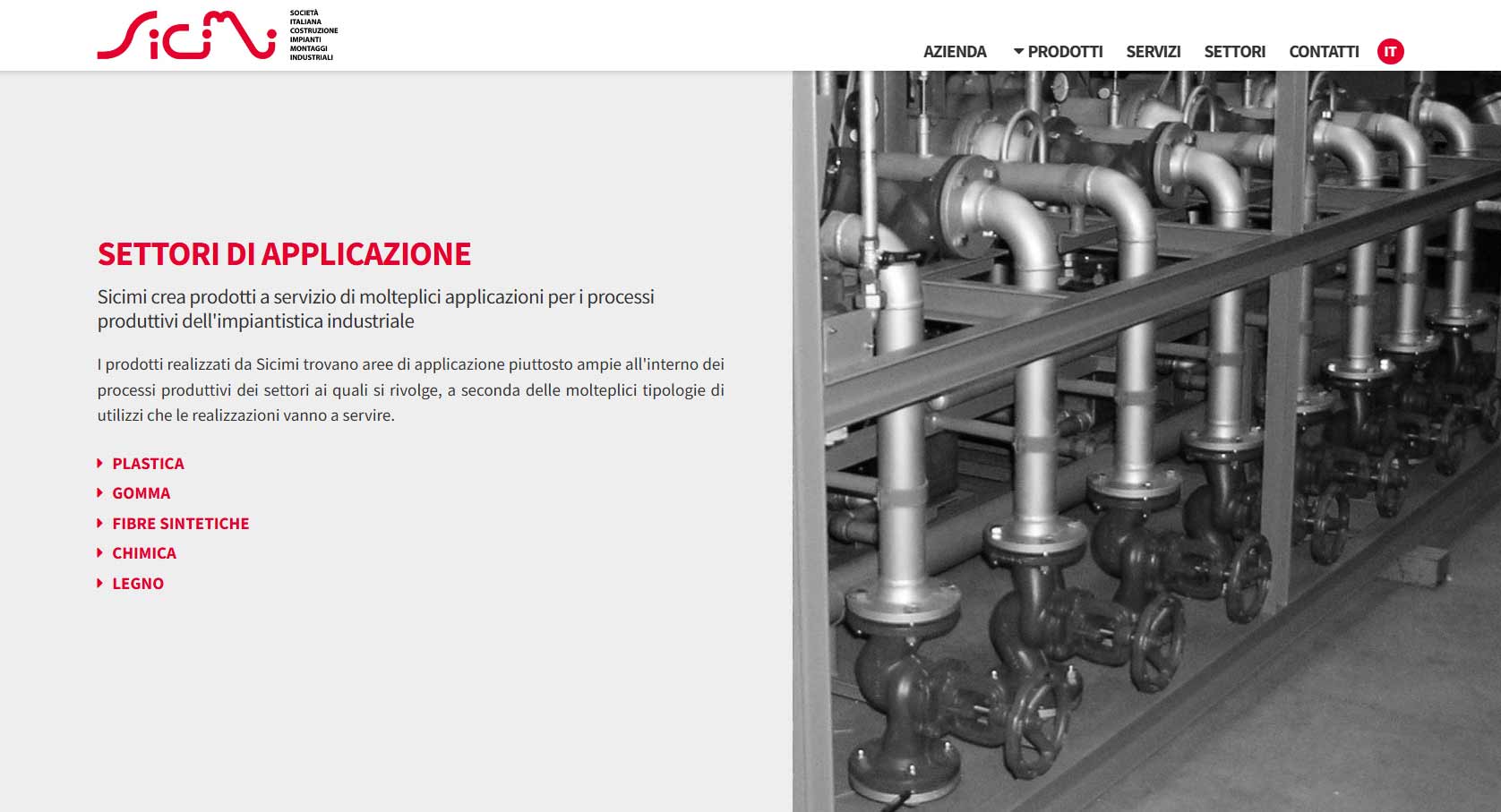
In conclusion, the brand identity design is completed with the design and development of the company website, created to maintain the same visual identity established across all other communication materials. The project features a fully customized layout, built on a fluid grid and designed to showcase both the technical content and the company’s high level of technological expertise. Particular attention was given to the use of photographs of Sicimi’s temperature-control systems and installations, which are also used as visual elements throughout the different sections of the website.
To make the main manufacturing sectors served by the company immediately recognizable, I also designed custom graphic icons for the different applications:
- wood industry;
- synthetic fibers;
- chemical industry;
- plastics;
- rubber.
Together with the typography, colors and other elements of the corporate identity, these icons create a consistent visual system within the web interface. The website was developed in pure HTML, without using WordPress or other CMS platforms. This approach made it possible to create extremely lightweight and fast code, minimizing unnecessary components and potential vulnerabilities associated with plugins, updates and external platforms. The result is a website requiring very little technical maintenance, without the recurring costs typically associated with CMS-based websites and their plugins.
The website was developed in Italian and English, with a structure optimized from an SEO perspective and dedicated code for the two language versions.


Mobile First Layout
An effective corporate identity must be designed not only for traditional communication materials, but also for the way brands are now viewed on smartphones and tablets. For this reason, the website was developed using a Mobile First approach, designing the content structure and interface to remain readable and easy to navigate even on smaller screens. Responsive layout automatically adapts grids, images, text, menus and graphic elements to different screen sizes while maintaining the visual hierarchy of the corporate identity. In conclusion, the objective was not simply to make the website “mobile compatible”, but to make the mobile browsing experience an integral part of the communication project, just as it is with brochures, catalogs and other corporate materials.

The Website
The project was designed to be fast, lightweight and easy to navigate on any device, while maintaining the visual identity developed for the company. Visit the Sicimi website to see the project online. This project is also part of my web design and WordPress development portfolio.
Favicon design
Design of the symbol (favicon). Including a logo design pro, from which derives the idea of the logo, it can be represented by a unique symbol that immediately identifies itself.


