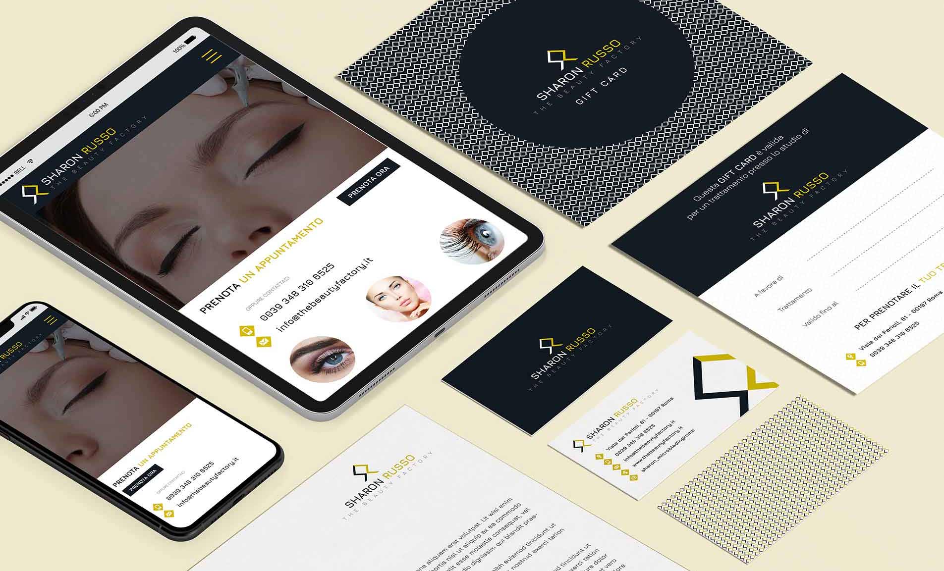
front-end design for a beauty center website
design of HTML mockups
Client request
This beauty center in Rome requested to have a clean, clear and modern website design that kept the style of the design brand initial letters created. The front-end design will have to be developed with the latest technologies available to date regarding the use of fluid HTML structures that can automatically adapts to any device, cause the large amount of different mobile devices available on the market today. The designs will be done based on this mobile-first fluid grid structure.
front-end design idea
First of all I thought that making good use of white to have a clean layout, although for the buttons and some areas I preferred to alternate with black and gold. The main colors from the identity and shades of gray and black play an important role. Icons, images and some important titles will be animated slightly when they pop up while scrolling.
Icons design process took a long time and a custom font was created that included all the visual icons, in order to have a set in harmony with everything, including the logo.
The layout is fluid, with a good ux design responsive, mobile-first and adaptable according to any device, whatever it is. All the website design at the moment only presents 2 variations fonttypes, which is not bad for compressing the loading time of the site also from a seo perspective.

Activity
Realization of dynamic website design, ux design, creation of previews and front-end design in HTML mockups.
SECTOR
Branding for Salons and Beauty Centers
Locality
Brand identity design created in Rome, Italy
Website design
| Web colors | bea72a | 050f1c | 939598 |

A Designed Interface, Not a Purchased Template
A custom website design delivers a truly distinctive product, built around the brand and the project’s specific needs.Increasingly, web design is reduced to choosing a pre-made template from thousands of online options, simply swapping out colors, images, and texts. Furthermore, relying on automated tools and AI-driven solutions risks replicating the exact same visual patterns already used by countless other sites. In this project, however, every interface component was designed from the brand identity up.
The goal was to create a recognizable graphic system that stands out clearly from any generic, off-the-shelf commercial template.

Images and Visual Communication
A central role within the project was given to images of professionals at work, with particular emphasis on microblading activities and various permanent makeup techniques.The photographs were not treated merely as decorative elements, but as an integral part of the website’s communication strategy. The layout was specifically designed to grant the images the space needed to showcase the precision, technique, and quality of the professionals’ work, helping to instantly convey the high standards of the academy and its courses.

Interface Design and Website Functionalities
The project went beyond defining the general graphic style; it involved designing wireframes and mockups for the key areas and functionalities of the site. Every interface was meticulously studied to ensure consistency with the new visual identity and easy adaptability to the technical structure chosen for development.
Special attention was dedicated to the training courses section, designing a calendar to display the educational offers, available courses, and their respective detailed overviews. Each course was organized to allow users to easily check the syllabus, core information, pricing, and enrollment steps through an interface designed to make the decision process as seamless as possible.Additionally, a professional course price list was designed, alongside the various interface components needed to present information, services, and educational content in an orderly fashion.
All interface elements—buttons, menus, cards, lists, typography, icons, info boxes, and navigation components—were styled according to a coherent visual system, creating a truly proprietary graphic template. This structure was conceived to be later applied to various CMS platforms on the market or integrated into a custom-built system.This approach ensures total control over the design without being bound to the visual constraints of a predefined theme.

UI System Designed to be Reusable
All interface elements were studied and styled to establish a coherent and easily replicable visual system. Buttons, headings, cards, menus, informational elements, forms, and section components follow a shared logic, allowing them to be deployed across various pages without losing visual harmony.
The objective was to build a flexible UI template that is not tied to a single platform. The designed system can indeed be adapted to most CMS platforms or implemented within a custom-built solution.

A Web Design and Brand Identity Project
This project is featured in my Web Design and Front-End development portfolio, representing a case study where I also directed the project’s Brand Identity.
The web interface design was therefore developed from an already established visual identity, ensuring seamless continuity across the logo, color palette, typography, imagery, and digital components. You can view the full project in my Brand Identity portfolio.