Branding dental aligner
wordmark logo design
Client design request
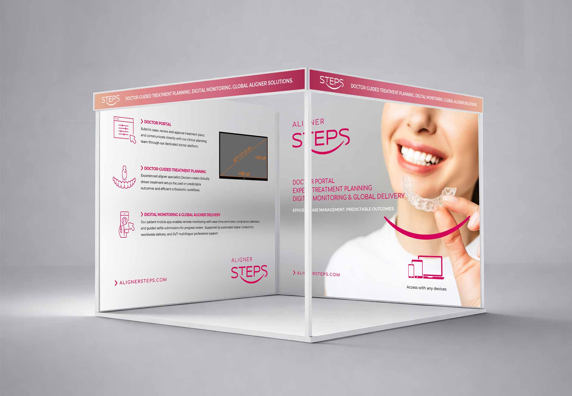
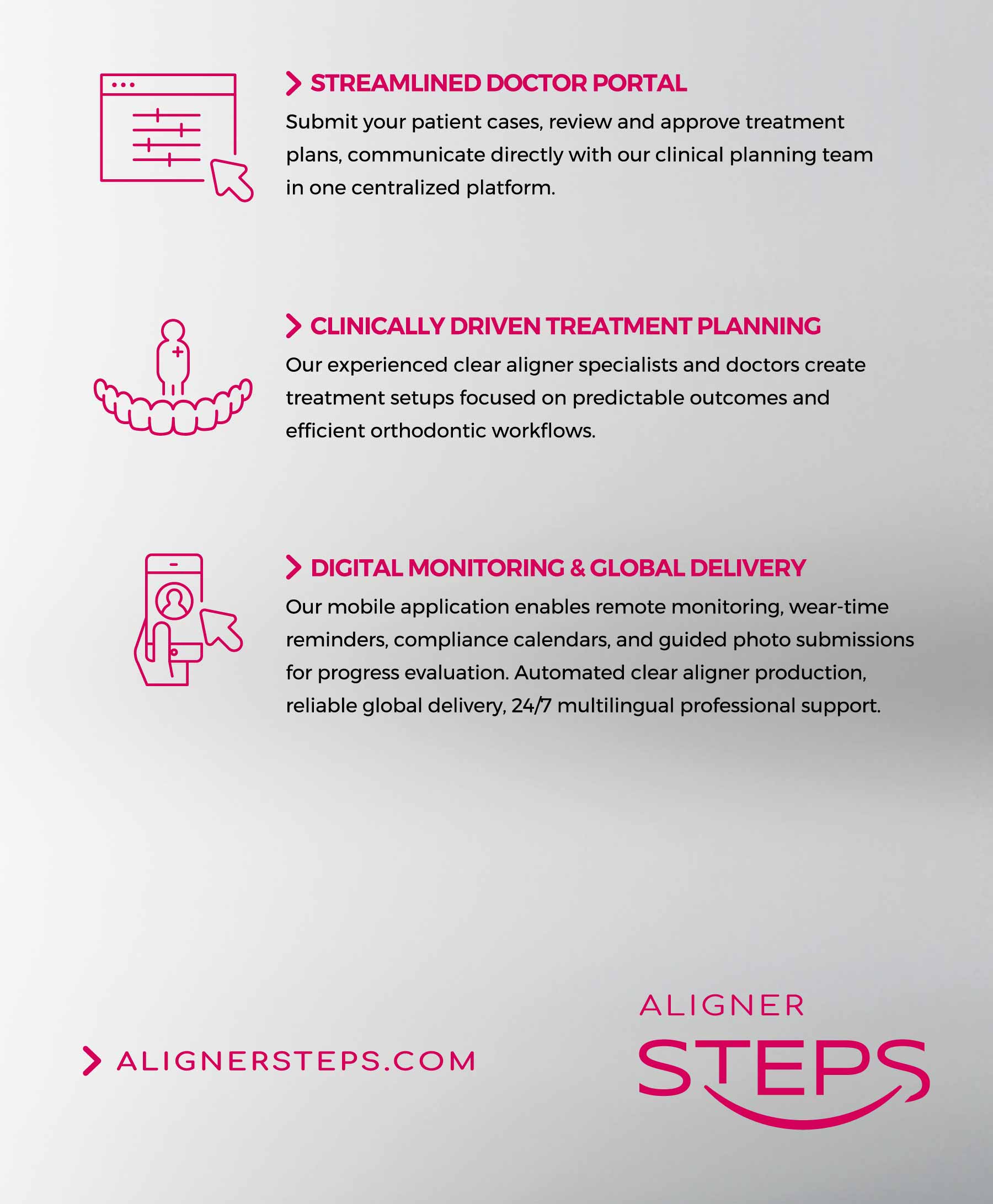
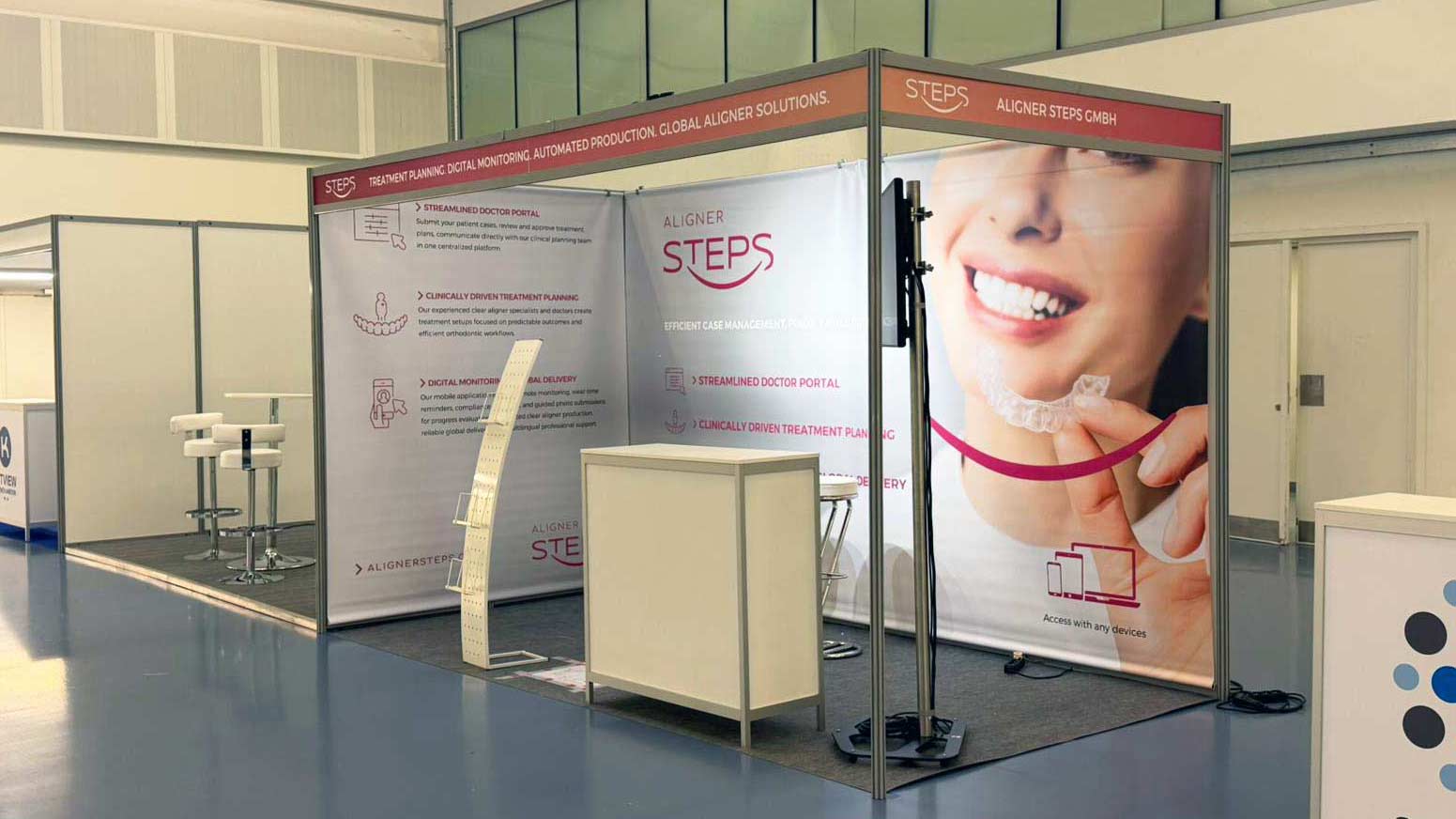
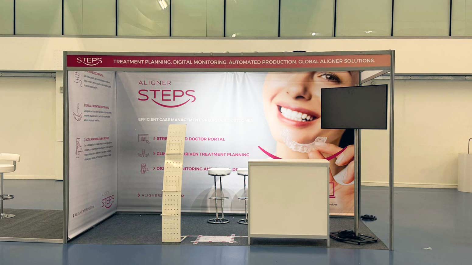
This company in Germany that produces transparent dental aligners and, depending on the shape of the tooth, different phases and different aligners are foreseen (hence the name steps), requested the creation of the brand identity design: professional logo design (wordmark type), business cards and letterhead and a company profile design to be used as a brochure presentation to customers and investors.
Logotype design idea
The logo is designed as a wordmark, communicating aesthetics and the positive experience of using dental aligners to achieve a perfect smile. Complementary graphic elements, such as the smile, convey optimism for the future, happiness, and personal satisfaction. The overall identity is modern, fresh, and tailored specifically to a younger demographic. Additionally, the arrow element signifies progression toward the next “step”—referencing the process of transitioning through the dental aligners included in the user’s treatment plan (which typically contains over 20 aligners).
These visual elements—the smile, the facial contours, and the teeth—are further amplified through a strategic use of color.
This project represents an example of a Brand Identity developed for a German company operating in a foreign market. The research and design strategy carefully considered the specific industry standards and the need to build a flexible visual system, easily adaptable across diverse communication channels.
Discover more about my design approach for international companies.

Activities
Wordmark logo design, Brand identity design with business cards and letterhead.
Locality
Germany.