Automotive Branding Restyling
Motorsport Suspensions
Project Brief
Kolb is a premier engineering center and workshop specializing in the construction, servicing, and calibration of sports dampers and racing suspensions. It operates as the official authorized partner with an exclusive license for Öhlins Racing in the Czech Republic. The company’s core business targets a highly demanding market: official motorsport teams, independent racing stables, and private drivers looking for the perfect setup for high-performance track and road cars.The initial request focused on the need for a comprehensive Automotive Branding strategy combined with a professional Logo Restyling. The strategic goal was twofold: to project the corporate image toward modern, high-tech standards while preserving the heritage, reputation, and brand awareness accumulated over the years.
Brand Restyling and Visual Design
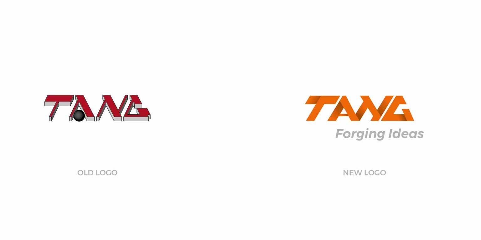
During the initial brief analysis, it became clear that a Logo Redesign was the most effective approach compared to creating a brand from scratch. Being a wordmark logo, the design intervention redefined the geometry of the characters to convey the core values of motorsport: extreme performance, high-tech uniqueness, and speed.
The main structural flaws of the old brand identity were resolved through:
- Legibility Optimization: The original tagline and slogan were completely redesigned and re-proportioned, ensuring optimal visual rendering on both digital mediums and printed assets.
- Dynamic Injection: The main lettering was slanted and shaped to visually evoke aerodynamics, movement, and the mechanical stability of racing suspensions on the track.
- Brand Awareness: The distinctive features of the original brand were evolved into a minimalist style, allowing the company to elevate its visual quality without alienating its historic customer base.

Activity
Automotive Branding consulting, Logo Redesign, stationery design, and professional business cards.
Sector
Branding for Industrial and Technology Companies
Restyling & Rebranding
Locality
Prague, Czech Republic.