logotype restyling
Grydan
Client request
Grydan, IT professionals and consultants with twenty years of experience, requested a logotype restyling. The request was to improve the current brand and make it immediately recognisable.
restyling idea
The restyling created corrects the problem of the horn (which means a demon), making it clearly visible even at small dimensions, but maintaining a strong recognizability with the old logo. I cut some letters and some letter’s spaces have been corrected. Abstract graphic backgrounds were created to be used to reinforce the identity and then create graphics and backgrounds for the website.
I create 3) versions of the logotype restyling: First of all, as a symbol that can also be used alone to immediately identify the brand. The symbol is also used to give life to backgrounds and graphic elements for added value to the identity. Second, Symbol+name, brand variant to be used when the logo must be printed in small dimensions, where the tagline cannot be readable. And finally the symbol+name+tagline variant, where the tagline helps a lot to immediately define your business sector.

activities
Corporate brand restyling, business card design, and development of a WordPress website with an integrated blog.
SECTOR
Restyling & Rebranding
Branding for Financial, Business & Corporate
Locality
Lomazzo, Como – Italy.
Website design

Restyling comparison
Here the new and current logos are compared. The old logo was in raster graphics.


Identity design
Preview of the identity design for letterhead and business card, the other real examples were created only to provide an example where you can see the logo used.

WordPress website and digital communication
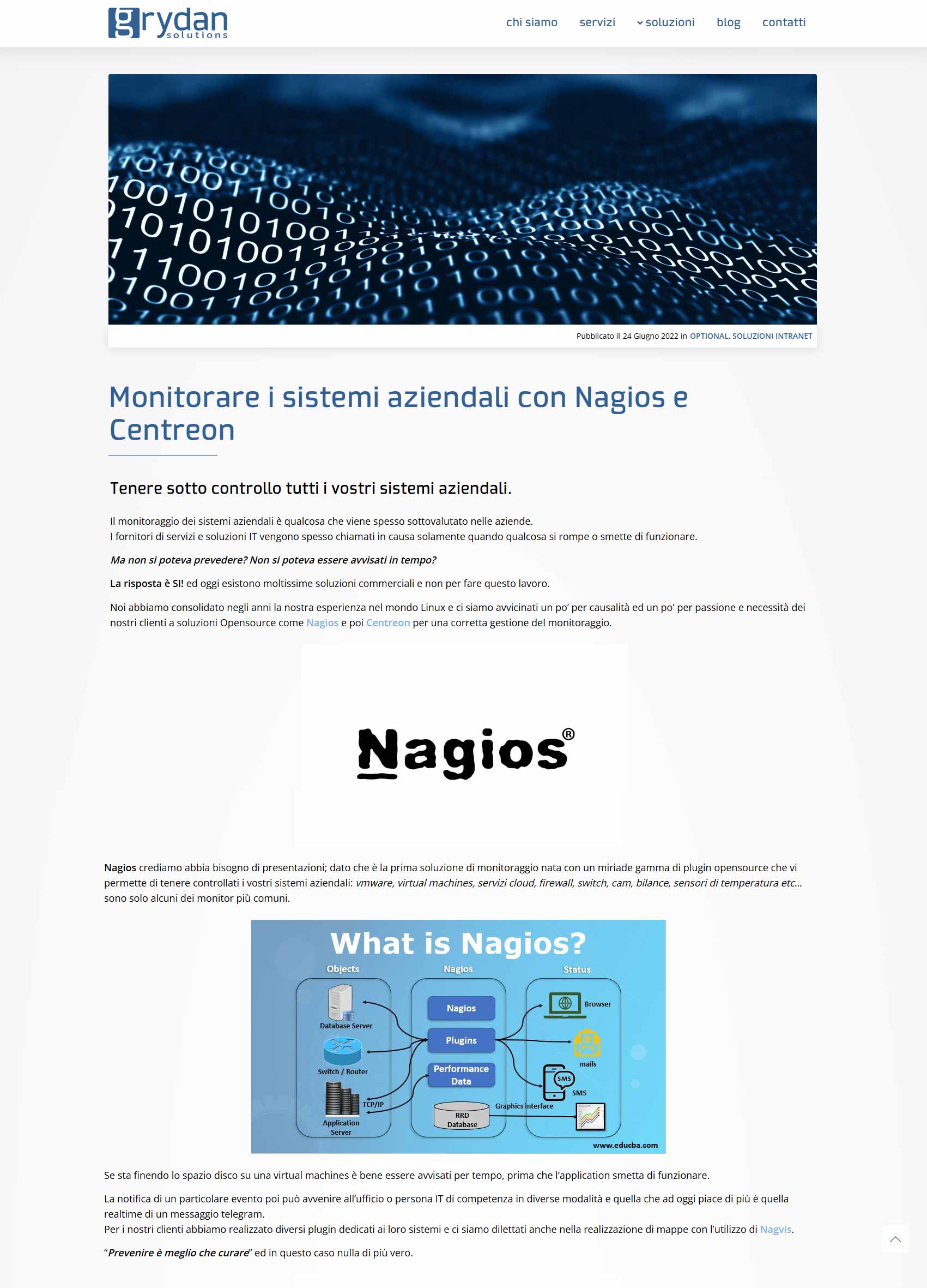
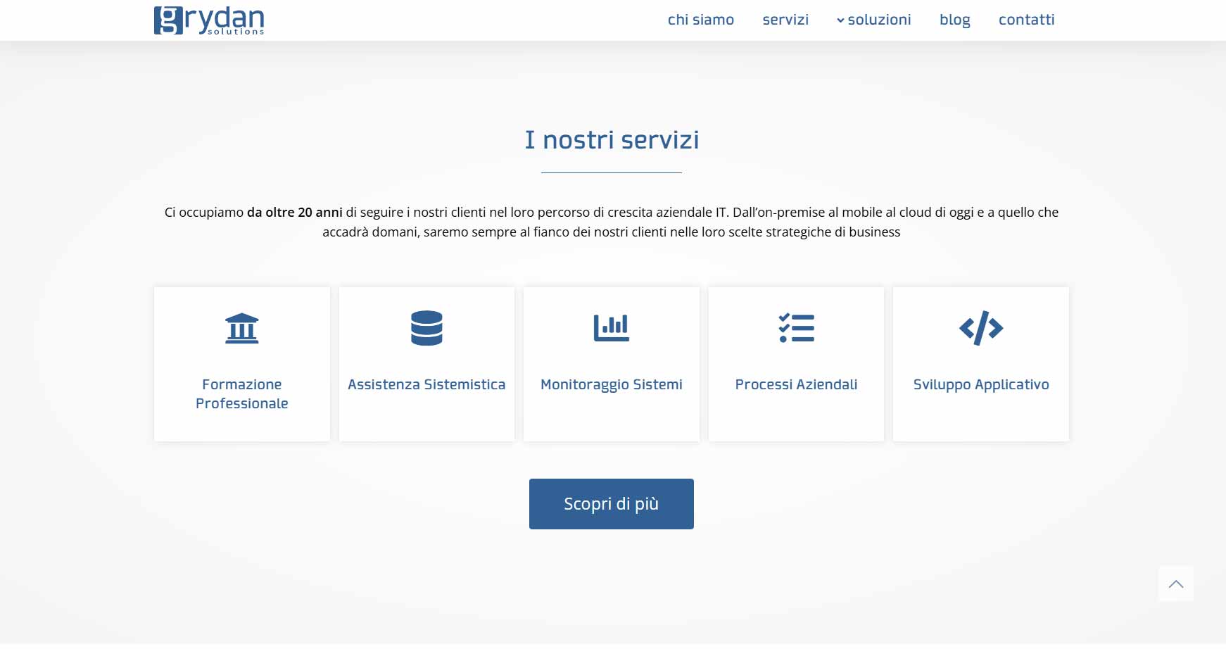
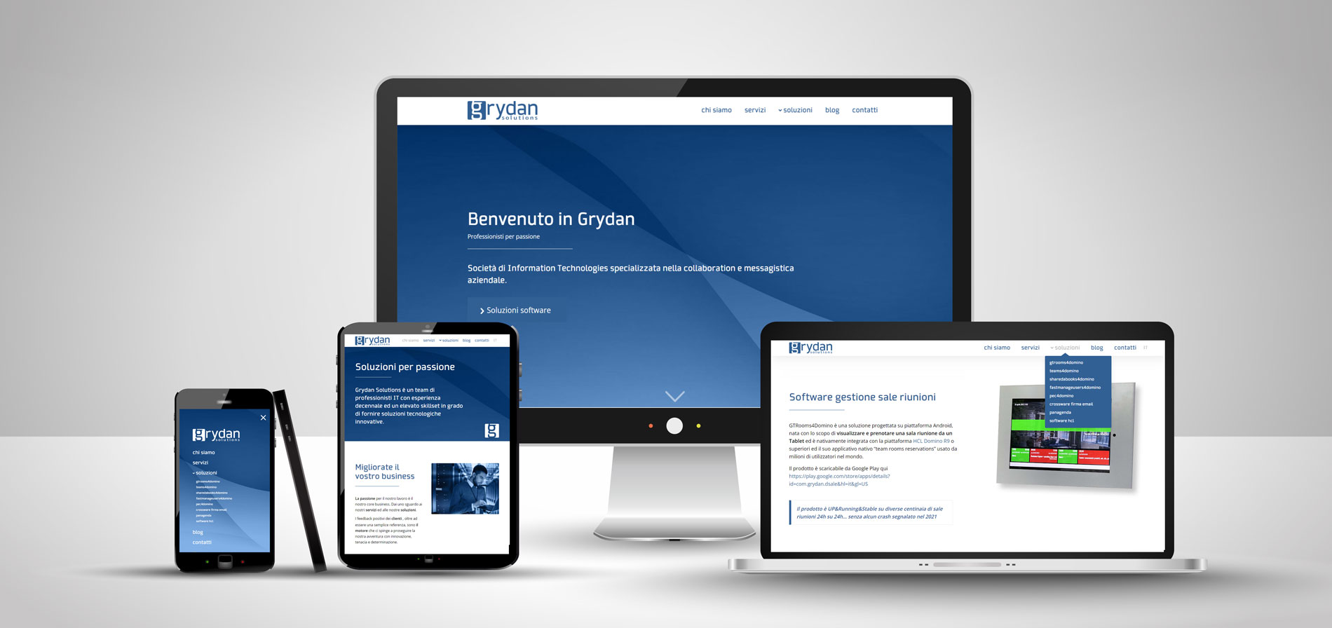
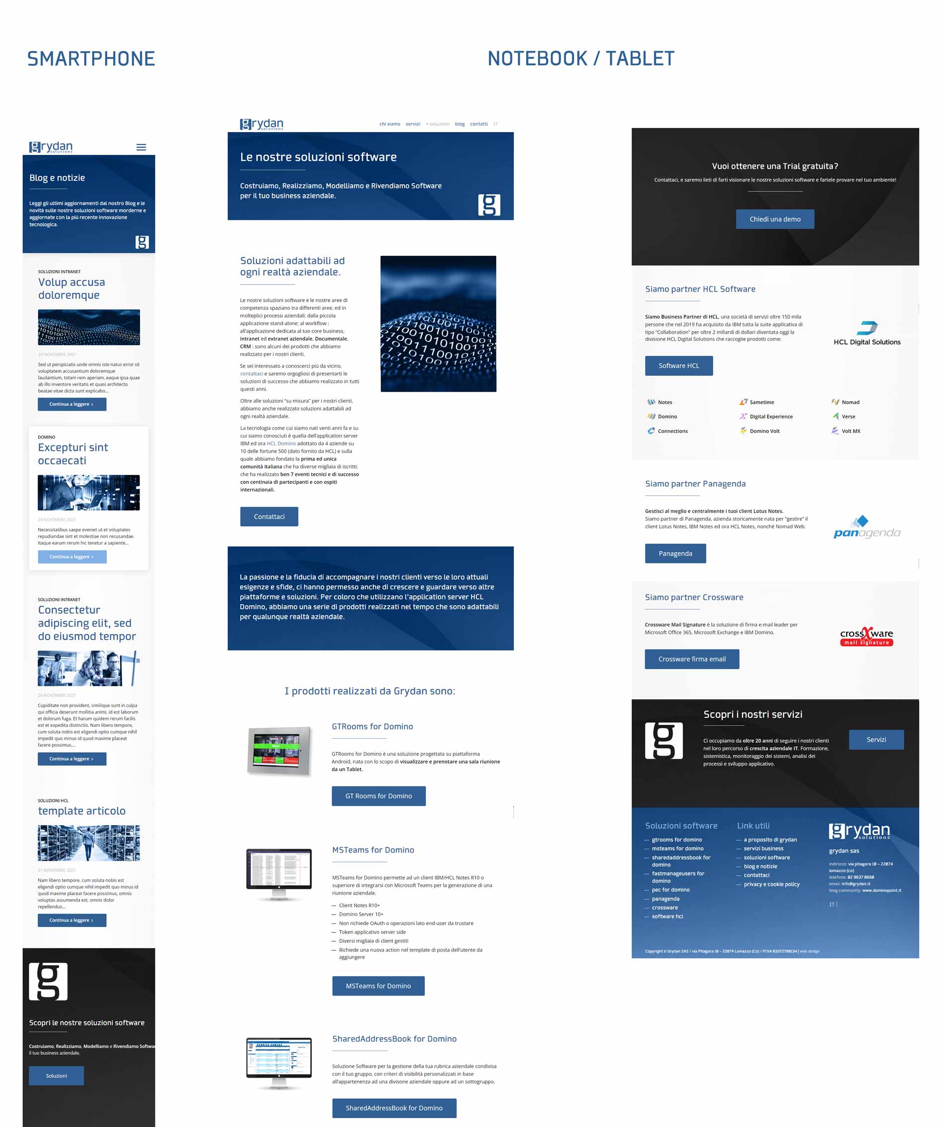
Following the brand restyling, I extended the new visual identity to the design and development of the corporate WordPress website. The layout was built around Grydan’s services and content, maintaining a consistent style across all pages and using blue as the dominant element of the communication.
To present the different software solutions more clearly, I created custom icons and reworked the application screenshots, placing them into cleaner and more engaging graphic compositions. This makes even the most technical content instantly recognizable and easier to browse. Special attention was dedicated to responsive design. Structure, text, images, spacing, and calls to action were adapted and tested for desktop, tablet, and smartphone, ensuring the mobile version was not just a scaled-down version of the main layout.
Integrated blog and content management
The site also includes a blog developed directly in WordPress, featuring a dedicated article archive page, thematic categories, and a specific template for individual posts.The structure allows the company to publish new content while always maintaining the same graphic layout. During development, I also expanded and revised some texts for SEO purposes, differentiating the content of the various pages to avoid repetition and make the service presentation clearer.
The project is also part of my web design and WordPress development portfolio.