
Brand identity Tecnosas
Logo, brochure and website for cosmetic packaging machinery
Client request
The whole brand identity was completely redesigned starting from the logo, to the corporate brochure and the website, to make it completely responsive. Referring to the high technological profile that distinguishes the company, I wanted to customize the whole design with a strong presence of the white colours representing cleanness and precision and the aquamarine colours that characterizes the company image.
Tecnosas’ strong point is to design and build machines which are tailored to customers’ needs, putting at their service creativity and great technical competence, key features in an extremely demanding and complex field such as that of cosmetics and make-up.
Design idea
I started from the restyling of the logo in vector format, correcting some inaccuracies originating and setting a uniform standard, together with different versions to be used for the brand identity. Then I switched to the design of the business cards and the folding brochure – which is also a documents folder– and the website. The style of these products is harmonious, and effectively communicates the renewal of the whole brand identity.
Color Palette and Visual System
The brand was rebuilt in vector format, precisely defining shapes, proportions, and colors to allow its use in both print and digital communication.The color palette was developed around the Pantone 7717 C, 316 C, and 629 C colors, which were used to create a consistent and recognizable visual hierarchy. The new graphic system was then applied to the other company collateral, ensuring that each asset did not appear as an independent element.

ACTIVITIES
Design brand identity industrial cosmetics: business card, brochure design and modern webdesign responsive.
SECTOR
Branding for Industrial and Technology Companies
LOCALITY
Brand identity created in Grantola, Varese, Italy.
Web design
| Logo Design Color PANTONE | 7717C | 316C | 629C |

Brand Identity and Business Card
This double-sided business card was designed as an integral part of the new corporate identity. The layout, typography, colors, and logo usage reflect the characteristics defined in the brand identity project, creating seamless continuity between printed materials and other communication tools. The result is a professional asset that is immediately traceable to the company, engineered to maintain legibility and recognizability even in a predominantly B2B context


Corporate Brochure and A4 Trifold Flyer
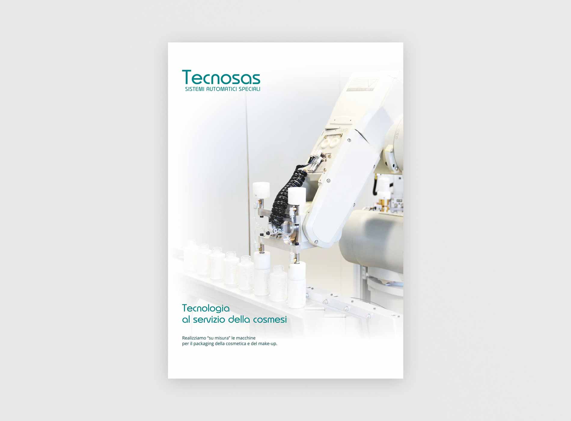
One of the main elements of the project was the design of a corporate trifold brochure, developed in two language versions: Italian and English. The document starts from a standard A4 format and, once opened, unfolds into three adjacent A4 panels with double-sided printing. This structure allows for organizing a significant amount of information while maintaining an orderly and easily scannable reading flow. The brochure was not conceived as a simple promotional handout, but as a commercial tool intended to present the company, its main fields of activity, and its related cosmetic packaging solutions in a concise and professional manner.
Discover other print projects in my brochure portfolio.

Corporate Website Design
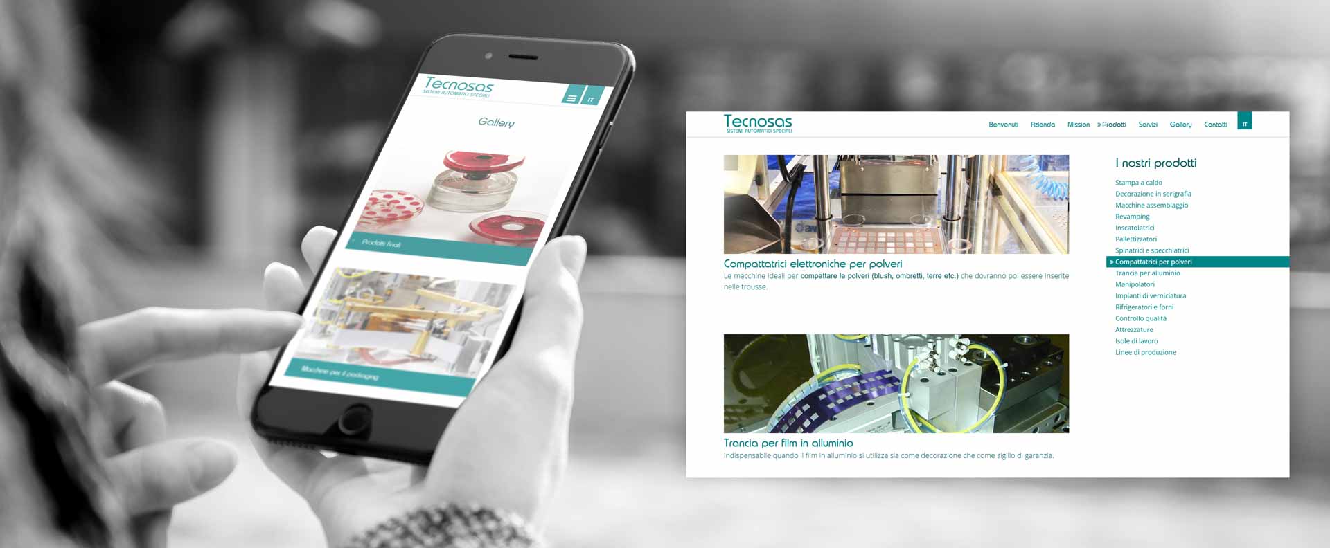
First of all, the new brand image was subsequently transferred to the design of the responsive website. The site adopts the same graphic layout developed for the brochure, using colors, visual elements, and typographic hierarchies consistent with the brand identity. The goal was to ensure that the communication maintained its recognizability when transitioning from print to screen. Responsive layout also automatically adapts the content structure to different devices, ensuring clear navigation from desktops, smartphones, and tablets alike.In this way, the brochure and the website become two different tools that belong to the same corporate communication system. This project is also featured in my web design and WordPress development portfolio.

An Identity Designed for the Industrial Sector
The project demonstrates how even a highly technical company can leverage design to make its communication clearer and more recognizable. In the case of Tecnosas, the work involved not only the logo but the entire path through which the company presents itself: visual identity, marketing collateral, and digital presence. Consistency across these elements helps build a professional and easily recognizable image, which is particularly important for a B2B company that needs to communicate complex technical solutions to clients and professional stakeholders.


